Comparison
Which is bigger or smaller?
Examples: Revenue by region, performance vs targets
The Scene: Your CEO opens your dashboard. She has 30 seconds before her next meeting. Does she immediately know what action to take?
Or does she squint, scroll, and close it with a frustrated "Can you just tell me what this means?"
The difference between these two outcomes isn't your data quality or technical skills. It's whether you've applied the fundamental principles of visual communication that make insights crystal clear.
This isn't magic. It's methodology. Learn the frameworks, principles, and techniques that transform confusing dashboards into decision-making tools your organization can't live without.
Show Me How →Every visualization answers one of six questions. Pick yours:
Which is bigger or smaller?
How is this changing over time?
Are these two things related?
How is data spread out?
What makes up the whole?
What's the order from best to worst?
Your audience should grasp your main message in 10 seconds. If they can't, simplify.
Remove ambiguity. Every element should be instantly understandable.
Tell the truth. No misleading scales or cherry-picked data.
Less is more. Remove anything that doesn't serve the story.
Every pixel serves the business objective.
Different audiences need different approaches.
What they need: Big picture, not details
KPIs, trends, forecasts, strategic implications
Scorecards, simple trend lines, high-level summaries
What they need: Actionable details, right now
Breakdowns, alerts, drill-throughs, operational metrics
Tables, heatmaps, detailed charts, real-time data
What they need: Clear, jargon-free updates
Status, progress, next steps, benefits
Progress bars, simple cards, plain language
Quick reference organized by what you're trying to show.
When you need to compare values across categories
When you need to show change over time
When you need to find relationships between variables
When you need to understand data spread
When you need to show parts of a whole
When you need to show ordered performance
For specific use cases
Learn from common visualization mistakes.
| ❌ Don't | Why It's a Problem | ✅ Do Instead |
|---|---|---|
| Use 3D charts | Distorts perception of values | Use 2D charts for clarity |
| Too many colors | Creates confusion and visual fatigue | Limit to 3–5 colors with consistent palette |
| Truncate axes | Misleads the audience | Start axes at zero unless clearly justified |
| Overload with data | Audience can't find the key message | Highlight key metrics and use filters |
| Ignore your audience | Wrong level of detail | Tailor for executives, operators, or customers |
| Skip labels | Leaves interpretation open | Include titles, legends, and units |
| Rely only on color | Not accessible for colorblind users | Use patterns, labels, or annotations |
| Add decorative elements | Adds noise without value | Remove unnecessary graphics |
A step-by-step approach from question to insight.
What decision needs to be made? What question are you answering? Don't start with the data—start with the business problem.
Is this comparison, trend, correlation, distribution, composition, or ranking? Use the framework above to identify what you're showing.
Based on your insight type, select the most appropriate visualization from the chart library.
Are you designing for executives, operators, or customers? Adjust detail level and complexity accordingly.
Ensure clarity, accuracy, simplicity, and relevance in every design decision.
Can someone grasp the main message in 10 seconds? If not, simplify further.
For complex analytics projects, follow this seven-stage process:
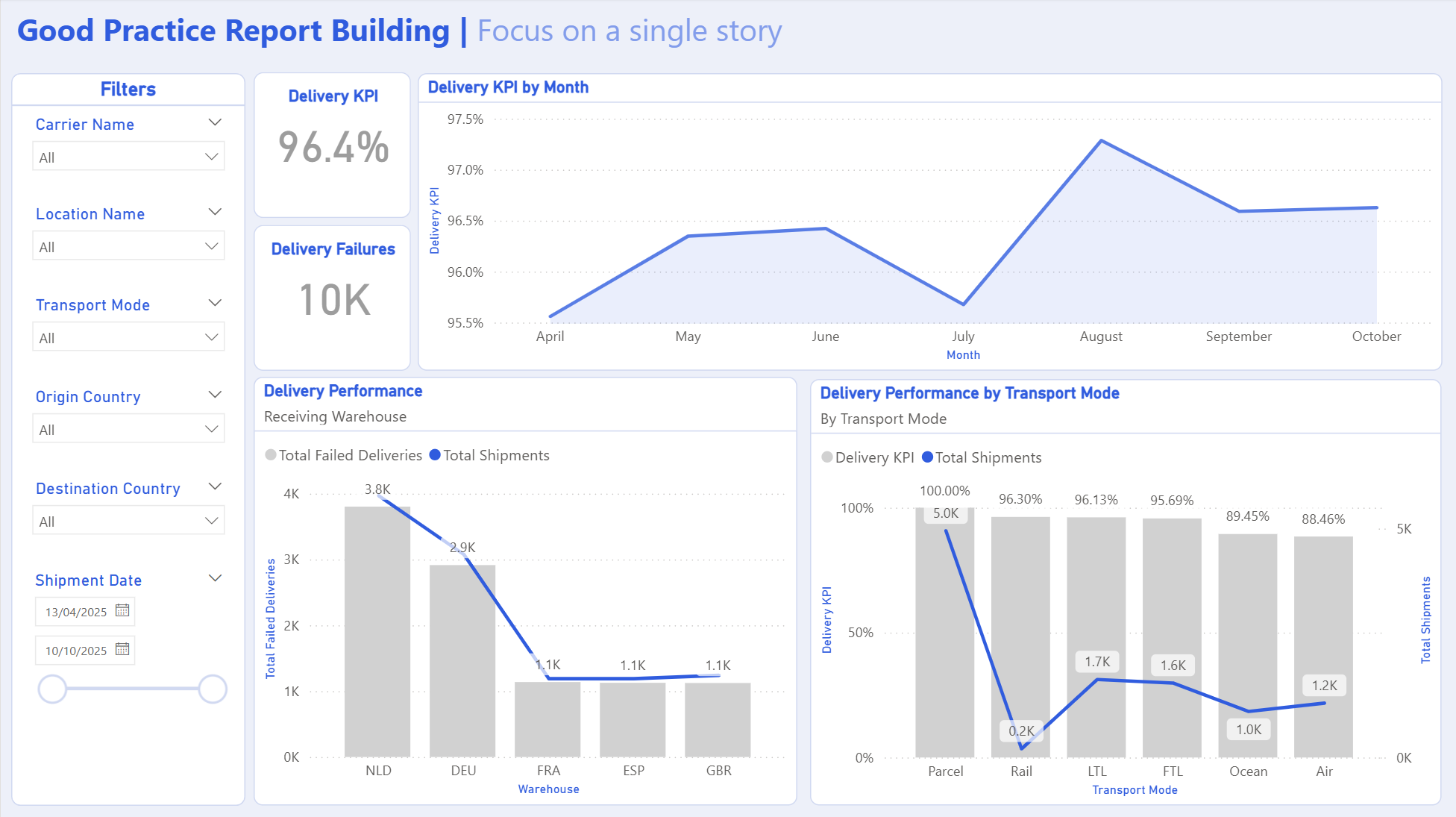
See how the framework works in practice.
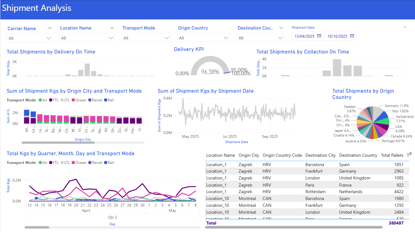
Build a dashboard to show monthly delivery performance for the operations team.