
Bar / Column Chart
A bar chart compares categories such as routes, carriers, or depots side by side. It’s the simplest and most honest way to rank supply-chain performance.
Do and don't
More examples: common pitfalls
These are some of the most frequent mistakes we see in real dashboards. Learn to spot and fix them:


Do's
-
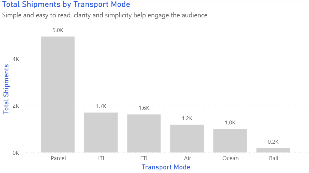
Sort bars by performance.
Sorting by average delay or cost immediately shows where attention is needed.
-
Label the data directly.
Values beside bars stop readers hunting for legends and make comparisons faster.
-
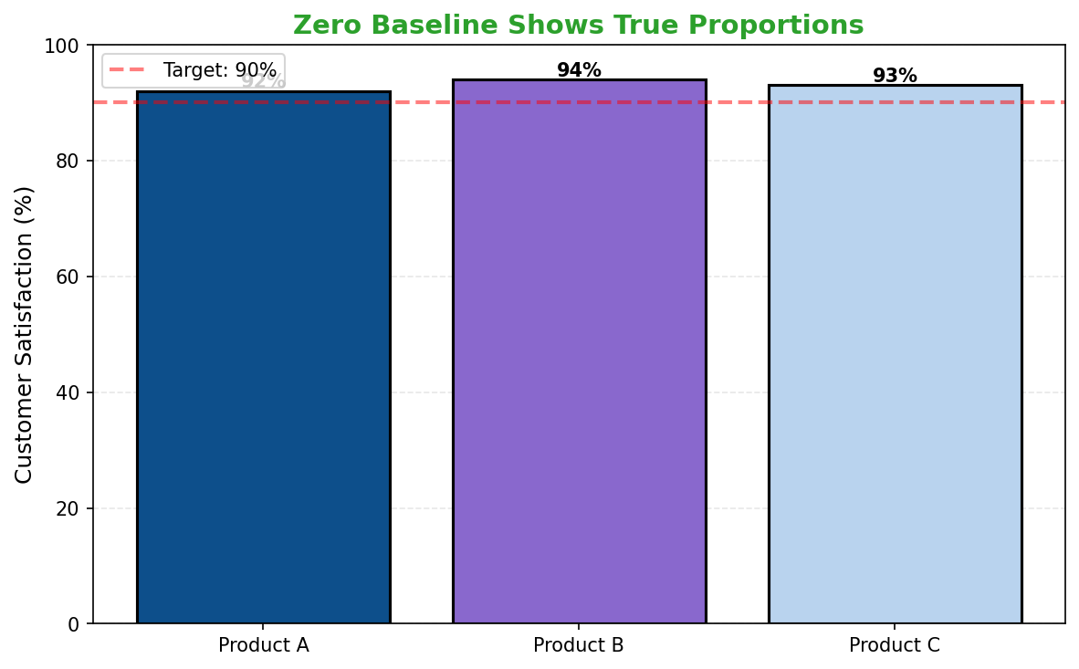
Start at zero.
Preserves visual honesty in metrics like hours, costs, or incidents.
Don'ts
-
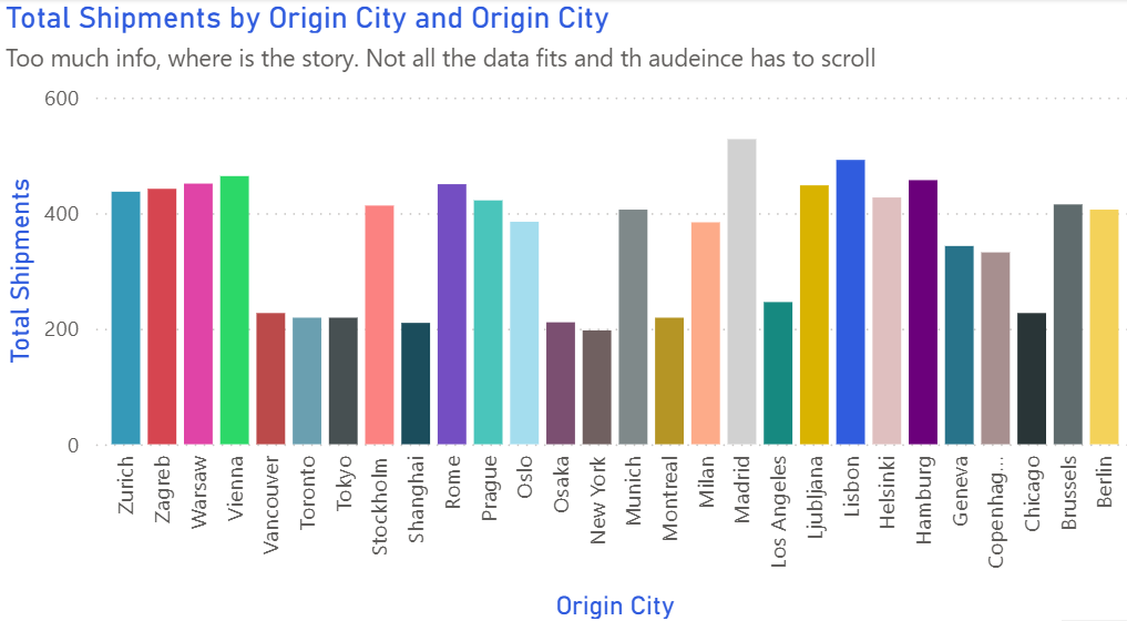
Don’t overload categories.
Summarise long tails or split visuals when routes exceed a dozen.
-
Avoid rotated labels.
Use horizontal bars for long route names.
-
Skip 3D effects.
They distort perception and reduce credibility.
Use cases
-
Top 10 routes by delay
Highlights systemic bottlenecks across the network.
-
Orders by carrier
Compares partner workload and contractual balance.
-
Incidents by depot
Reveals hotspots for retraining or process fixes.
Common mistakes to avoid
Even experienced analysts make these errors. Here's how to spot and fix them:
Using 3D bars
Why it's bad: The perspective distorts values, making accurate comparison impossible.
Fix: Always use 2D bars. If you want visual interest, use color or borders instead.
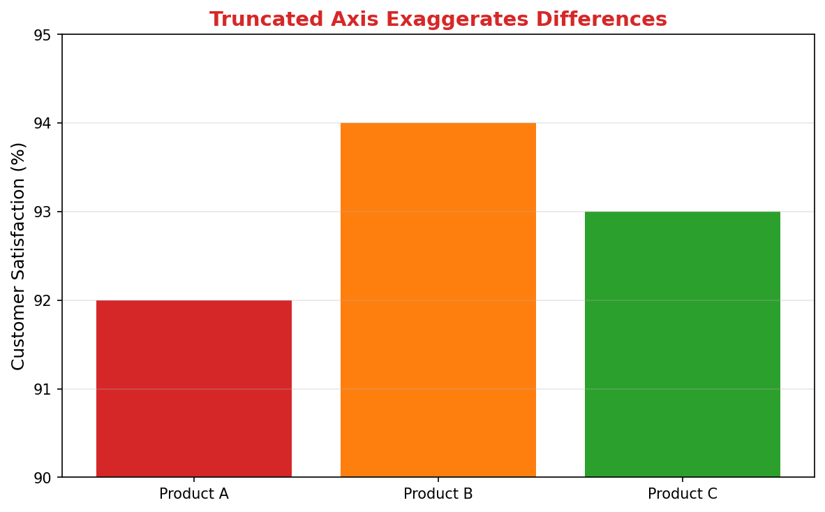
Starting axis above zero
Why it's bad: Exaggerates small differences and misleads viewers.
Fix: Start at zero unless there's a compelling reason (and clearly label if you don't).
Too many categories
Why it's bad: Creates visual clutter and makes comparison difficult.
Fix: Show top 10-12, group the rest as "Other", or use small multiples.
Accessibility guidelines
Make your visualizations accessible to everyone, including users with visual impairments, color blindness, or who rely on screen readers.
Color Considerations
Use colorblind-safe palettes:
- Avoid: Red-green combinations (8% of men are red-green colorblind)
- Use: Blue-orange, purple-yellow, or add patterns/textures
- Test: Use tools like Color Oracle or Coblis to simulate color blindness
Recommended palettes:
Contrast & Legibility
Meet WCAG 2.1 standards:
- Text contrast: Minimum 4.5:1 for normal text, 3:1 for large text
- Chart elements: 3:1 contrast between adjacent colors
- Labels: Use dark text on light backgrounds (or vice versa)
Font guidelines:
- Minimum 12pt for body text, 14pt+ preferred
- Avoid decorative or overly thin fonts
- Use bold for emphasis, not color alone
Screen Reader Support
Essential elements:
- Alt text: Describe the chart's key insight, not just "bar chart"
- Data tables: Provide raw data as an accessible table alternative
- Aria labels: Use aria-label for interactive elements
Example alt text:
"Bar chart showing sales increased 30% from Q1 to Q2, with Q2 reaching $2.5M. Technology had the highest growth at 45%."
Additional Techniques
Don't rely on color alone:
- Use patterns, textures, or shapes to differentiate categories
- Add direct labels to data points when possible
- Use icons or symbols alongside colors
Interactive features:
- Ensure keyboard navigation works (tab, arrow keys)
- Provide text summaries of key findings
- Allow users to toggle between visual and tabular views
Helpful resources
- Color Oracle: Free color blindness simulator for Windows, Mac, Linux
- WebAIM Contrast Checker: Test color contrast ratios
- ColorBrewer: Colorblind-safe color schemes for maps and charts
- WCAG 2.1 Guidelines: Full accessibility standards for web content
Story tip
Bar charts make ranking and prioritisation intuitive — perfect for route, carrier, and warehouse comparisons.