
KPI Card
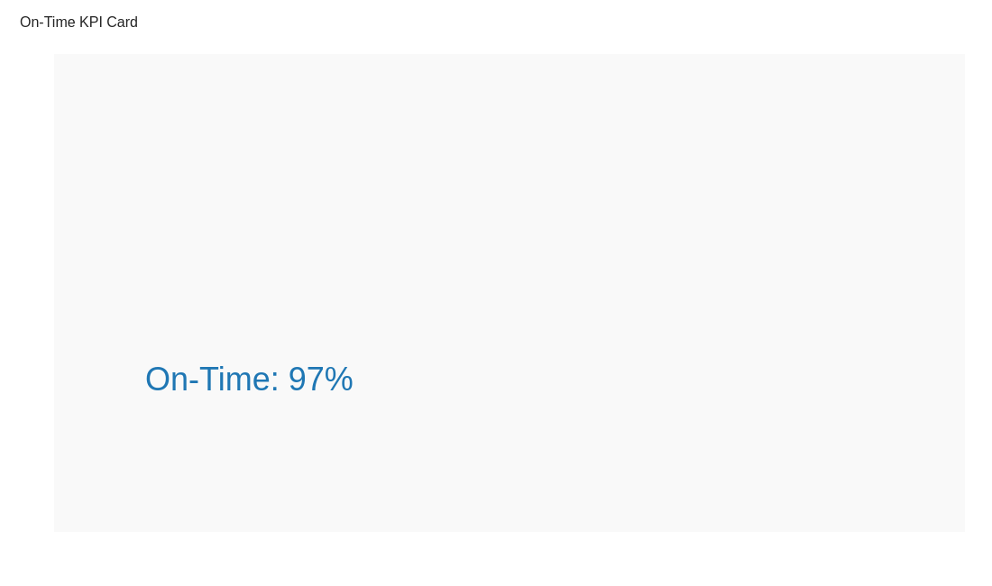
KPI cards summarise key metrics — ideal for headline numbers like on-time rate, cost per shipment, or carbon per tonne.
Do and don't
Do's
-
Keep to one message.
Each card should answer a single question, e.g., 'What’s our on-time rate?'
-
Use clear units and context.
Include %, £, or timeframe for meaning.
-
Highlight change subtly.
Show +/– versus target without distracting animation.
Don'ts
-
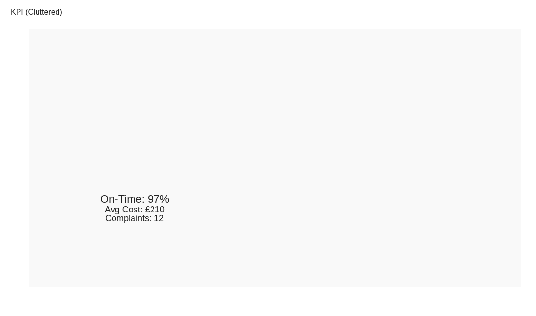
Avoid clutter.
Multiple KPIs on one card blur focus.
-
Don’t use inconsistent scales.
If stacked, ensure equal sizing for hierarchy.
-
Avoid over-styling.
Flat, simple text is easier to read across dashboards.
Use cases
-
On-time delivery rate
Headline indicator of reliability.
-
Average cost per shipment
Quick read for procurement efficiency.
-
Customer complaint volume
Gauge service quality at a glance.
Common mistakes to avoid
Even experienced analysts make these errors. Here's how to spot and fix them:
Overcomplicating the visual
Why it's bad: Too much information overwhelms the viewer and obscures the message.
Fix: Focus on one clear message per chart. Use multiple simple charts instead of one complex one.
Poor color choices
Why it's bad: Can make data hard to read or inaccessible to colorblind viewers.
Fix: Use colorblind-safe palettes and ensure sufficient contrast.
Missing context
Why it's bad: Data without context (targets, benchmarks, time period) is meaningless.
Fix: Always include titles, labels, units, and reference points.
Accessibility guidelines
Make your visualizations accessible to everyone, including users with visual impairments, color blindness, or who rely on screen readers.
Color Considerations
Use colorblind-safe palettes:
- Avoid: Red-green combinations (8% of men are red-green colorblind)
- Use: Blue-orange, purple-yellow, or add patterns/textures
- Test: Use tools like Color Oracle or Coblis to simulate color blindness
Recommended palettes:
Contrast & Legibility
Meet WCAG 2.1 standards:
- Text contrast: Minimum 4.5:1 for normal text, 3:1 for large text
- Chart elements: 3:1 contrast between adjacent colors
- Labels: Use dark text on light backgrounds (or vice versa)
Font guidelines:
- Minimum 12pt for body text, 14pt+ preferred
- Avoid decorative or overly thin fonts
- Use bold for emphasis, not color alone
Screen Reader Support
Essential elements:
- Alt text: Describe the chart's key insight, not just "bar chart"
- Data tables: Provide raw data as an accessible table alternative
- Aria labels: Use aria-label for interactive elements
Example alt text:
"Bar chart showing sales increased 30% from Q1 to Q2, with Q2 reaching $2.5M. Technology had the highest growth at 45%."
Additional Techniques
Don't rely on color alone:
- Use patterns, textures, or shapes to differentiate categories
- Add direct labels to data points when possible
- Use icons or symbols alongside colors
Interactive features:
- Ensure keyboard navigation works (tab, arrow keys)
- Provide text summaries of key findings
- Allow users to toggle between visual and tabular views
Helpful resources
- Color Oracle: Free color blindness simulator for Windows, Mac, Linux
- WebAIM Contrast Checker: Test color contrast ratios
- ColorBrewer: Colorblind-safe color schemes for maps and charts
- WCAG 2.1 Guidelines: Full accessibility standards for web content
Story tip
KPIs give dashboards rhythm — they’re the hooks readers remember.