
Heatmap
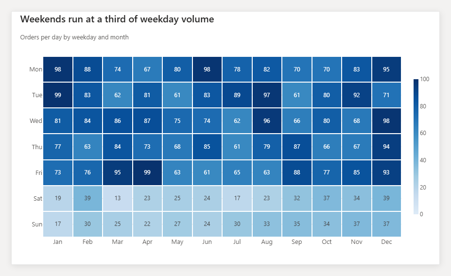
A heatmap lays two categories out as a grid and colours each cell by a value, so patterns across both dimensions show up at once: which weekdays are busy in which months, which products sell in which regions.
Do and don't
More examples: common pitfalls
These are some of the most frequent mistakes we see in real dashboards. Learn to spot and fix them:
Do's
-
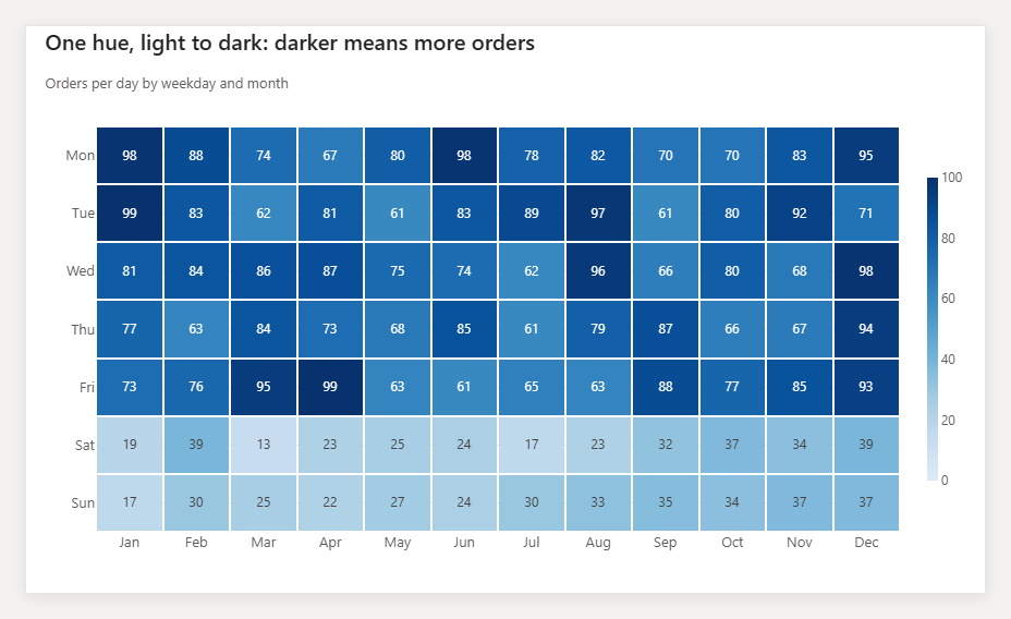
Use one hue, light to dark.
A single-hue sequential scale reads as 'more' without a legend. Dark means high, light means low.
-
Put the number in the cell.
Colour ranks the cells; the label lets the reader quote the value. Drop labels only when cells get too small.
-
Order the axes deliberately.
Sort rows by total or keep a natural order (days, months). Random order hides the pattern the heatmap exists to show.
Don'ts
-
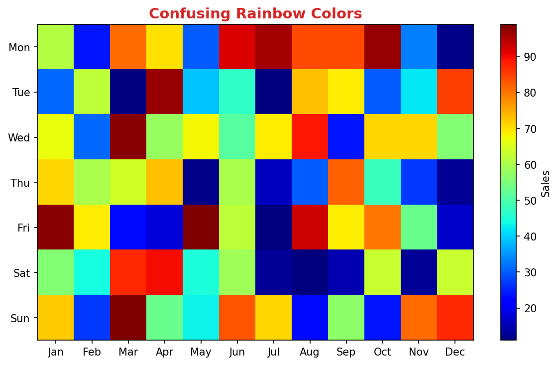
Don't use a rainbow scale.
Rainbow palettes have no natural order; readers cannot tell whether green is higher than yellow.
-
Don't shrink cells below the labels.
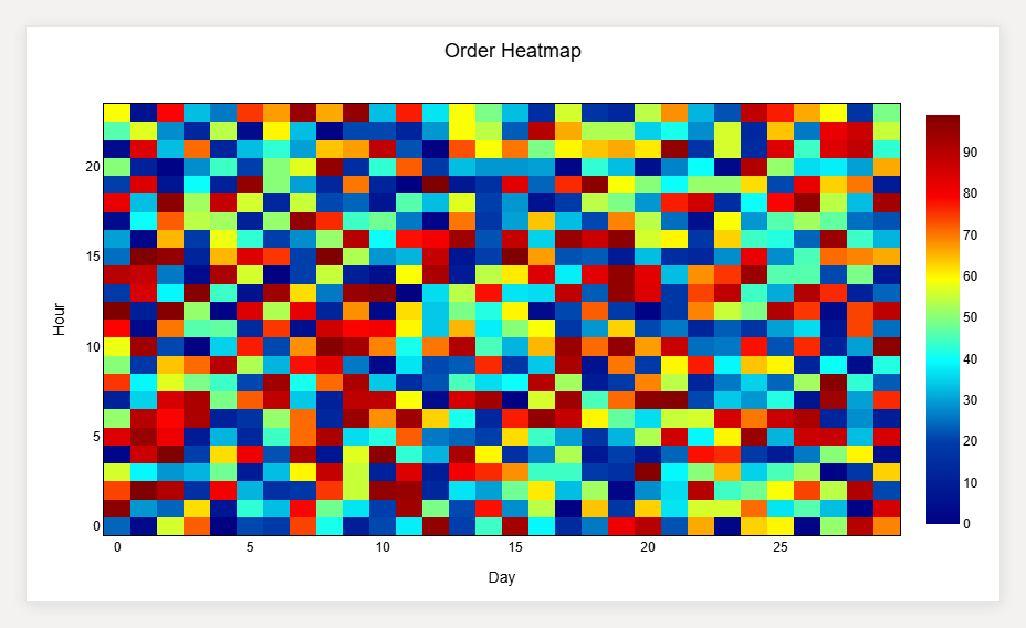
Fifty rows by fifty columns is a texture, not a chart. Aggregate or filter first.
-
Don't skip the colour legend.
Without a scale with units the colours mean nothing.
Use cases
-
Orders by weekday and month
Reveals weekly rhythm and seasonality in one view.
-
Product by region sales matrix
Highlights where a product over- or under-performs.
-
Hour-of-day by day-of-week demand
Standard for staffing and capacity planning.
Common mistakes to avoid
Even experienced analysts make these errors. Here's how to spot and fix them:
Poor color scale choice
Why it's bad: Rainbow scales mislead; colors should represent magnitude consistently.
Fix: Use sequential (light to dark) or diverging (two colors from center) scales.
Too many cells
Why it's bad: Tiny cells are impossible to distinguish and defeat the purpose.
Fix: Aggregate data or use filtering/clustering to reduce dimensions.
Missing labels or legend
Why it's bad: Users can't interpret what colors mean without context.
Fix: Always include clear axis labels and a color scale legend with units.
Accessibility guidelines
Make your visualizations accessible to everyone, including users with visual impairments, color blindness, or who rely on screen readers.
Color Considerations
Use colorblind-safe palettes:
- Avoid: Red-green combinations (8% of men are red-green colorblind)
- Use: Blue-orange, purple-yellow, or add patterns/textures
- Test: Use tools like Color Oracle or Coblis to simulate color blindness
Recommended palettes:
Contrast & Legibility
Meet WCAG 2.1 standards:
- Text contrast: Minimum 4.5:1 for normal text, 3:1 for large text
- Chart elements: 3:1 contrast between adjacent colors
- Labels: Use dark text on light backgrounds (or vice versa)
Font guidelines:
- Minimum 12pt for body text, 14pt+ preferred
- Avoid decorative or overly thin fonts
- Use bold for emphasis, not color alone
Screen Reader Support
Essential elements:
- Alt text: Describe the chart's key insight, not just "bar chart"
- Data tables: Provide raw data as an accessible table alternative
- Aria labels: Use aria-label for interactive elements
Example alt text:
"Bar chart showing sales increased 30% from Q1 to Q2, with Q2 reaching $2.5M. Technology had the highest growth at 45%."
Additional Techniques
Don't rely on color alone:
- Use patterns, textures, or shapes to differentiate categories
- Add direct labels to data points when possible
- Use icons or symbols alongside colors
Interactive features:
- Ensure keyboard navigation works (tab, arrow keys)
- Provide text summaries of key findings
- Allow users to toggle between visual and tabular views
Helpful resources
- Color Oracle: Free color blindness simulator for Windows, Mac, Linux
- WebAIM Contrast Checker: Test color contrast ratios
- ColorBrewer: Colorblind-safe color schemes for maps and charts
- WCAG 2.1 Guidelines: Full accessibility standards for web content
Story tip
Heatmaps answer 'where is it concentrated?' Lead with the darkest cells and say why they are dark.