
Histogram
Histograms show how a numeric measure is distributed across ranges — the quickest way to spot skew, outliers, or clustering before you model or segment.
Do and don't
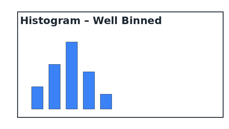
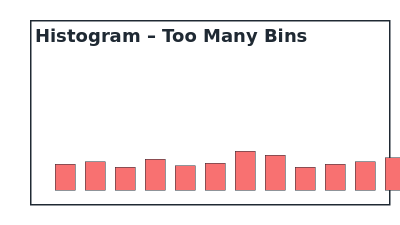
Do's
-
Let the data set the bins.
Pick bin widths that reflect the precision of your metric so the shape stays truthful.
-
Highlight thresholds.
Use reference lines or colours to mark acceptable ranges or alert limits.
-
Show the total count.
Include the sample size so stakeholders can judge whether patterns are robust.
Don'ts
-
Don’t overload bins.
Too many skinny bars hide the story; too few oversimplify it.
-
Avoid mixed metrics.
Don’t blend values with percentages — keep the y-axis in frequency or density.
-
Skip smoothing without explanation.
Kernel density curves are fine as an overlay, but explain the method and bandwidth.
Use cases
-
Delivery lead time spread
Spot whether most orders arrive on time or if a long tail of delays exists.
-
Order value distribution
Understand the proportion of micro-orders versus bulk shipments.
-
Sensor readings or quality scores
See whether production stays within tolerance bands.
Common mistakes to avoid
Even experienced analysts make these errors. Here's how to spot and fix them:
Wrong bin size
Why it's bad: Too few bins hide patterns; too many create noise.
Fix: Start with square root of N, then adjust based on data distribution.
Confusing with bar charts
Why it's bad: Histograms show continuous ranges, not discrete categories.
Fix: Remove gaps between bars and clearly label as "distribution" not "comparison".
No reference lines
Why it's bad: Hard to judge if distribution is normal, skewed, or meets thresholds.
Fix: Add mean, median, or threshold lines to provide context.
Accessibility guidelines
Make your visualizations accessible to everyone, including users with visual impairments, color blindness, or who rely on screen readers.
Color Considerations
Use colorblind-safe palettes:
- Avoid: Red-green combinations (8% of men are red-green colorblind)
- Use: Blue-orange, purple-yellow, or add patterns/textures
- Test: Use tools like Color Oracle or Coblis to simulate color blindness
Recommended palettes:
Contrast & Legibility
Meet WCAG 2.1 standards:
- Text contrast: Minimum 4.5:1 for normal text, 3:1 for large text
- Chart elements: 3:1 contrast between adjacent colors
- Labels: Use dark text on light backgrounds (or vice versa)
Font guidelines:
- Minimum 12pt for body text, 14pt+ preferred
- Avoid decorative or overly thin fonts
- Use bold for emphasis, not color alone
Screen Reader Support
Essential elements:
- Alt text: Describe the chart's key insight, not just "bar chart"
- Data tables: Provide raw data as an accessible table alternative
- Aria labels: Use aria-label for interactive elements
Example alt text:
"Bar chart showing sales increased 30% from Q1 to Q2, with Q2 reaching $2.5M. Technology had the highest growth at 45%."
Additional Techniques
Don't rely on color alone:
- Use patterns, textures, or shapes to differentiate categories
- Add direct labels to data points when possible
- Use icons or symbols alongside colors
Interactive features:
- Ensure keyboard navigation works (tab, arrow keys)
- Provide text summaries of key findings
- Allow users to toggle between visual and tabular views
Helpful resources
- Color Oracle: Free color blindness simulator for Windows, Mac, Linux
- WebAIM Contrast Checker: Test color contrast ratios
- ColorBrewer: Colorblind-safe color schemes for maps and charts
- WCAG 2.1 Guidelines: Full accessibility standards for web content
Story tip
Introduce histograms when the question is “How is this metric behaving overall?” — they set the stage for deeper diagnostics.