
Comparison
Which is bigger or smaller?
Revenue by region, performance against target, product rankings.
Use: Bar or column chart
A short, practical guide to delivering report visuals that people read and act on. No theory for its own sake: each page tells you what to do, what to avoid, and why.
Three decisions shape every report. Take them in this order.
Every chart answers one of six questions. Name the question first, then choose the chart that answers it best.
Chart selector →One story per page, headline numbers top-left, six to eight visuals at most. Layout is where most reports fail.
Report layout guide →Grey for context, one accent for the point, and a palette that still works for colour-blind readers.
Colour palettes →Every chart answers one of six questions. Pick yours and the chart type follows.
Which is bigger or smaller?
Revenue by region, performance against target, product rankings.
Use: Bar or column chart
How is this changing over time?
Monthly sales, traffic growth, seasonal patterns.
Use: Line chart, Area chart
Are these two things related?
Price against demand, marketing spend against sales.
Use: Scatter plot
How is the data spread out?
Customer ages, order values, response times.
Use: Histogram
What makes up the whole?
Market share, budget breakdown, category mix.
Use: Pie or donut, Waterfall
What is the order from best to worst?
Top salespeople, product performance, league tables.
Use: Sorted bar, Funnel chart
Also in the guide: KPI cards, tables and matrices, small multiples, maps, heatmaps.
Three questions, then a shortlist of charts with live previews.
Open →Twelve mistakes seen in real dashboards, each with a fix.
Open →Chart-selection cheat sheet, layout checklist, palette reference. No email required.
Download →Seven questions to test your instincts on chart choice.
Open →Two report pages built from the same data. One can be read in ten seconds.
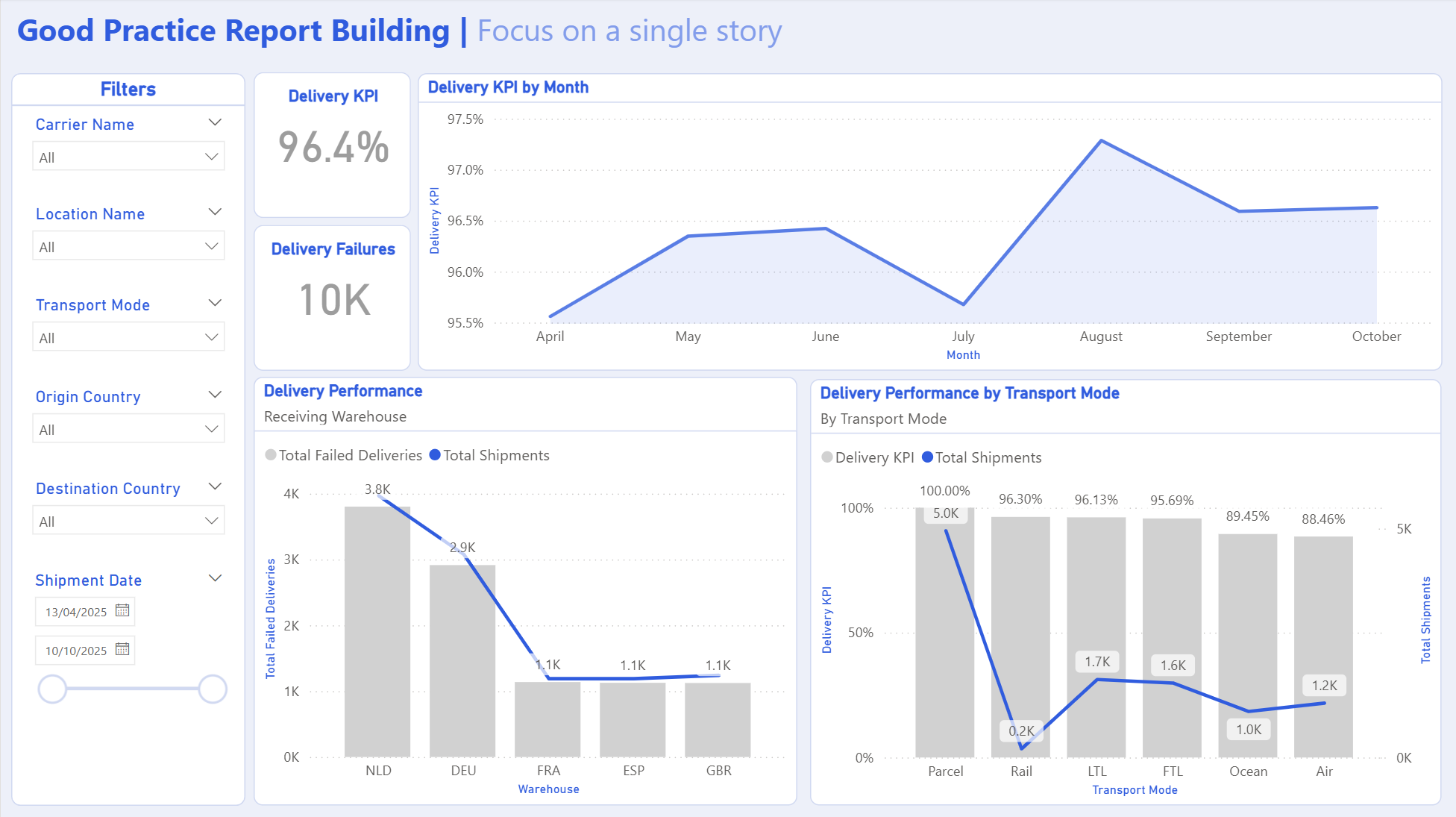
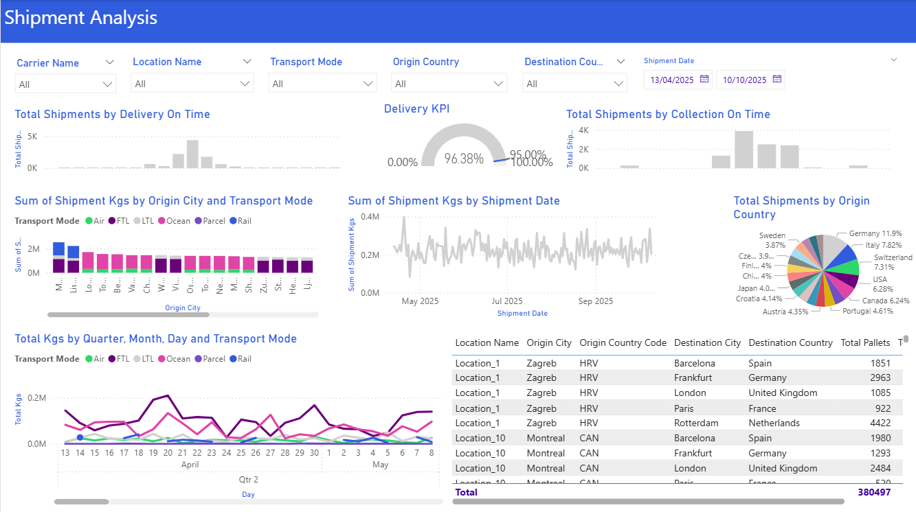
The same data needs a different page for each reader.
Big-picture trends, growth, risk, and customer satisfaction. Decisions about strategy and resources.
Headline KPIs, a simple trend, a forecast. Implications and recommendations, not detail.
Day-to-day performance, process efficiency, bottlenecks. Metrics they can act on now.
Detailed breakdowns, alerts, near-real-time data. Tables, heatmaps and drill-through.
Clear information about their service or product. Transparency without jargon.
Plain language and simple visuals. Progress bars, cards, status indicators.