Financial Reporting Transformation
How a mid-market manufacturer cut month-end close from 10 days to 3 days with automated variance analysis
The Challenge
A mid-market manufacturing company's CFO was frustrated with their month-end close process. The finance team spent 10+ days manually compiling reports from multiple systems, leaving little time for actual analysis before board meetings.
Key Problems:
- Month-end close took 10-12 days - too slow for decision-making
- Variance analysis buried in 50+ tab Excel workbooks
- No clear visibility into what drove P&L changes month-over-month
- Cash flow projections were static snapshots, not rolling forecasts
- Board meetings started with 2-hour financial reviews instead of strategic discussions
- Errors in manual consolidation required frequent corrections
The Solution
We redesigned their financial reporting to automate data consolidation and focus on exception-based reporting. Instead of presenting all numbers, we highlighted only significant variances and their drivers, allowing executives to focus on what matters.
Visual Transformation
❌ The Old Way: Confusing Tables
Executives had to scan through rows of numbers to find what mattered
✅ The New Way: Clear Waterfall Charts
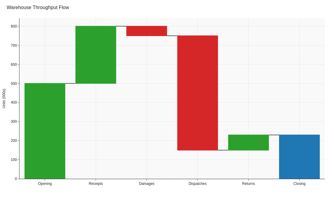
Waterfall charts instantly show what drove the $2M revenue increase
Before vs. After
❌ Before
- 10-12 days to close the books each month
- 50+ Excel tabs with manual formulas and links
- Static variance tables with no visual hierarchy
- 2-hour board presentations walking through every line item
- Errors discovered days after initial reports
- No time for forward-looking analysis
✅ After
- 3-day close with automated data pulls
- Single-page executive summary with drill-down capability
- Waterfall charts showing exactly what drove changes
- 20-minute board review focused on exceptions
- Real-time validation catches errors immediately
- Weekly rolling forecasts inform proactive decisions
4 Key Changes That Made the Difference
Automated Variance Analysis Dashboard
What we did: Built automated variance calculations with conditional formatting highlighting variances >10% or >$50K, whichever was lower.
Why it worked: Finance team no longer manually compared thousands of line items. The dashboard immediately showed the 12-15 items that actually mattered, reducing analysis time from 3 days to 4 hours.
Chart type: Heatmap with color-coded variance cells
P&L Waterfall Charts
What we did: Created waterfall visualizations showing month-over-month and year-over-year P&L bridges, breaking down exactly which revenue and cost categories drove changes.
Why it worked: Executives could instantly see "Revenue up $2M, but gross margin down $500K due to material costs." No more hunting through tables. The CFO reported this single change saved 90 minutes per board meeting.
Chart type: Waterfall chart (P&L bridge)
Rolling Cash Flow Forecast
What we did: Replaced static monthly cash snapshots with a 13-week rolling forecast updated weekly, showing actual vs. forecast with variance explanations.
Why it worked: Caught a potential cash shortage 6 weeks in advance (previously would have discovered it with only 1 week to react). CFO negotiated better payment terms proactively instead of emergency firefighting.
Chart type: Line chart with forecast bands and variance annotations
Exception-Based Executive Summary
What we did: Created a single-page summary showing only: (1) Top 5 positive variances, (2) Top 5 negative variances, (3) KPI scorecard, (4) Forward-looking risks/opportunities.
Why it worked: Board members received a 1-page summary instead of a 40-page deck. Meetings shifted from "reviewing numbers" to "discussing strategy." CEO quote: "We finally have time to talk about the future instead of explaining the past."
Chart type: Combination dashboard with scorecards and variance tables
Results
"We went from dreading month-end close to actually having time for analysis. The waterfall charts alone transformed our board meetings - we now spend 10 minutes on financials and 50 minutes on strategy. That's the conversation we should be having."
Technical Implementation
Key Takeaways
- Exception reporting wins: Show only what matters (variances >10% or >$50K), not everything
- Waterfall charts are CFO gold: Instantly show what drove P&L changes without hunting through tables
- Rolling forecasts beat snapshots: 13-week rolling view catches problems 6+ weeks earlier
- Automate consolidation, not analysis: Let systems pull data so finance can focus on insights
- One-page summaries force prioritization: If it doesn't fit on one page, it's not a priority
- Real-time validation saves days: Catch errors immediately instead of days later
Want to transform your financial reporting?
Learn which visualization techniques work best for variance analysis, P&L bridges, and cash flow forecasting.
Explore the Visual Guide