Area Chart
Area charts show how components build up over time — ideal for illustrating how freight modes or regions contribute to total shipments.
Example do and don't images
Do's
-
Use translucent fills.
Transparency keeps overlapping layers legible.
-
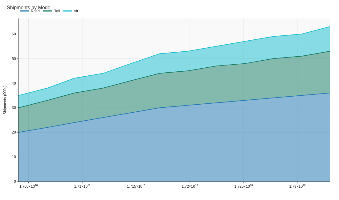
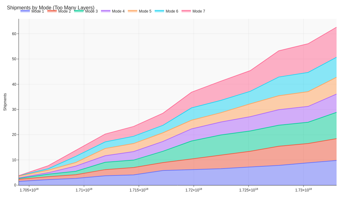
Limit to a few series.
Three to five categories is readable; beyond that, consider small multiples.
-
Annotate key shifts.
Highlight when one transport mode overtakes another or a depot expands capacity.
Don'ts
-
Avoid unrelated measures.
Stack only values that sum meaningfully, like tonnes shipped by mode.
-
Don’t over-granularise time.
Smooth weekly data to months if noise hides the trend.
-
Don’t rely on colour alone.
Differentiate layers with labels or light outlines for clarity.
Use cases
-
Cumulative shipments by mode
Shows road, rail, and air contributions to overall volume.
-
Energy use by fleet type
Tracks sustainability metrics over time.
-
Capacity planning
Visualises total throughput and seasonal peaks.
Common Mistakes to Avoid
Even experienced analysts make these errors. Here's how to spot and fix them:
Stacking without order
Why it's bad: Middle series become impossible to read accurately.
Fix: Place most important series at the bottom, or use small multiples instead.
Using for negative values
Why it's bad: Area charts imply accumulation; negatives create visual confusion.
Fix: Use line charts for data with negative values.
Overlapping areas
Why it's bad: Obscures data and makes comparison impossible.
Fix: Use transparency or switch to line chart with different markers.
Accessibility Guidelines
Make your visualizations accessible to everyone, including users with visual impairments, color blindness, or who rely on screen readers.
Color Considerations
Use colorblind-safe palettes:
- Avoid: Red-green combinations (8% of men are red-green colorblind)
- Use: Blue-orange, purple-yellow, or add patterns/textures
- Test: Use tools like Color Oracle or Coblis to simulate color blindness
Recommended palettes:
Contrast & Legibility
Meet WCAG 2.1 standards:
- Text contrast: Minimum 4.5:1 for normal text, 3:1 for large text
- Chart elements: 3:1 contrast between adjacent colors
- Labels: Use dark text on light backgrounds (or vice versa)
Font guidelines:
- Minimum 12pt for body text, 14pt+ preferred
- Avoid decorative or overly thin fonts
- Use bold for emphasis, not color alone
Screen Reader Support
Essential elements:
- Alt text: Describe the chart's key insight, not just "bar chart"
- Data tables: Provide raw data as an accessible table alternative
- Aria labels: Use aria-label for interactive elements
Example alt text:
"Bar chart showing sales increased 30% from Q1 to Q2, with Q2 reaching $2.5M. Technology had the highest growth at 45%."
Additional Techniques
Don't rely on color alone:
- Use patterns, textures, or shapes to differentiate categories
- Add direct labels to data points when possible
- Use icons or symbols alongside colors
Interactive features:
- Ensure keyboard navigation works (tab, arrow keys)
- Provide text summaries of key findings
- Allow users to toggle between visual and tabular views
📖 Helpful Resources
- Color Oracle: Free color blindness simulator for Windows, Mac, Linux
- WebAIM Contrast Checker: Test color contrast ratios
- ColorBrewer: Colorblind-safe color schemes for maps and charts
- WCAG 2.1 Guidelines: Full accessibility standards for web content
Story tip
Area charts illustrate how the whole builds from its parts, great for showing mix and growth in supply networks.