Marketing Analytics Transformation
How a SaaS company cut campaign analysis time by 75% with clear visual storytelling
The Challenge
A rapidly growing SaaS company was struggling to understand which marketing channels were driving real value. Their marketing team spent hours each week compiling data from multiple platforms into sprawling spreadsheets.
Key Problems:
- Campaign performance buried in 50+ column spreadsheets
- No clear view of customer journey across channels
- Attribution confusion - which touchpoints actually mattered?
- Weekly reports took 6 hours to compile and present
- Executives couldn't quickly identify underperforming campaigns
The Solution
We redesigned their marketing dashboard to focus on actionable insights rather than data dumps. The new approach emphasized visual clarity and storytelling over comprehensive data display.
Visual Transformation
❌ Confusing Funnel
Original funnel was cluttered and hard to interpret - where are prospects dropping off?
✅ Clear Conversion Path
New funnel instantly shows the 65% drop-off at Consideration stage
Before vs. After
❌ Before
- 50+ columns in Excel spreadsheet
- No visual hierarchy or prioritization
- Mix of metrics with no clear story
- Required 30-minute presentation to explain
- Updated manually once per week
✅ After
- 3 hero metrics on landing page
- Clear visual hierarchy (pipeline → conversion → ROI)
- Focused funnel showing drop-off points
- Self-explanatory in under 10 seconds
- Auto-refreshed daily via API
4 Key Changes That Made the Difference
Channel Performance Heatmap
What we did: Replaced a 12-column table with a heatmap showing CAC (Customer Acquisition Cost) vs. LTV (Lifetime Value) by channel.
Why it worked: Instant visual identification of high-ROI channels (green) vs. money-losers (red). The CMO could spot underperformers in 5 seconds instead of 5 minutes.
Chart type: Scatter plot with color-coding and quadrants
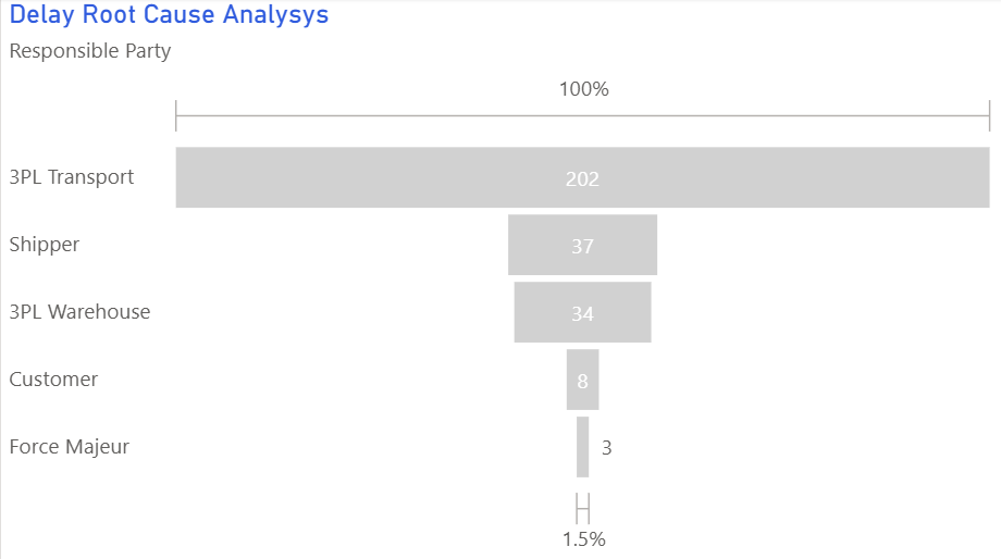
Conversion Funnel with Drop-offs
What we did: Created a multi-channel funnel showing where prospects dropped off at each stage (Awareness → Consideration → Decision → Purchase).
Why it worked: Made leaky stages obvious. Revealed that "Consideration" stage had 65% drop-off - leading to immediate content strategy changes.
Chart type: Funnel chart with conversion rates labeled
Trend Lines for Early Warning
What we did: Added 12-week trend lines for key metrics (MQLs, SQLs, CAC) with forecast projections.
Why it worked: Spotted declining MQL quality 3 weeks earlier than before, allowing proactive campaign adjustments instead of reactive firefighting.
Chart type: Line charts with trend lines and targets
Attribution Sankey Diagram
What we did: Visualized customer journey flows from first touch to conversion using a Sankey diagram.
Why it worked: Revealed that 40% of conversions had "organic search → webinar → demo" path - leading to doubled webinar investment with 3x ROI.
Chart type: Sankey (flow) diagram
Results
"We went from drowning in data to actually understanding our customer journey. The funnel visualization alone saved us $50K in wasted ad spend by showing exactly where prospects were dropping off."
Technical Implementation
Key Takeaways
- Less is more: 3 hero metrics beat 50 columns of data every time
- Show the journey: Funnel and Sankey diagrams reveal customer behavior patterns hidden in tables
- Use color strategically: Heatmaps make good/bad performance instantly obvious
- Include trends, not just snapshots: Trend lines enable proactive decision-making
- Design for your audience: Executives need 10-second insights, analysts need drill-down capability
Want to improve your marketing dashboards?
Explore our visual guide to learn which chart types work best for different marketing metrics.
Explore the Visual Guide