🚫 Data Visualization Mistakes Gallery
Learn from real examples of confusing charts. See what makes visualizations fail and how to fix them.
Why This Gallery Exists
Even experienced analysts create confusing visualizations. These mistakes aren't about being "bad" at data viz – they're about not knowing what to watch out for.
This gallery shows real patterns we see in dashboards every day. Each example explains what went wrong and how to fix it. Use this as a checklist before sharing your next report.
Bar Chart Mistakes
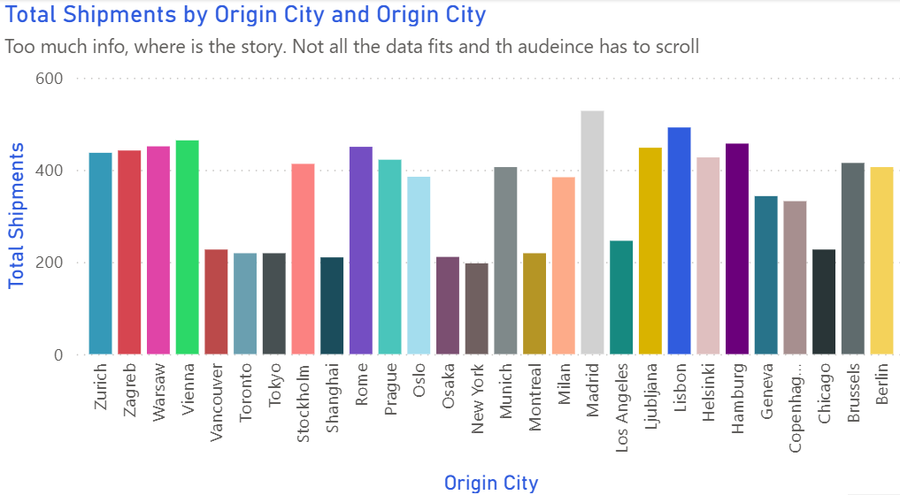
Too Many Colors
⚠️ The Problem:
Using a different color for each bar creates visual noise. Viewers don't know which bars to focus on, and the chart becomes overwhelming.
✅ The Fix:
Use one color for all bars, then highlight important ones with a contrasting color. This immediately shows what matters.
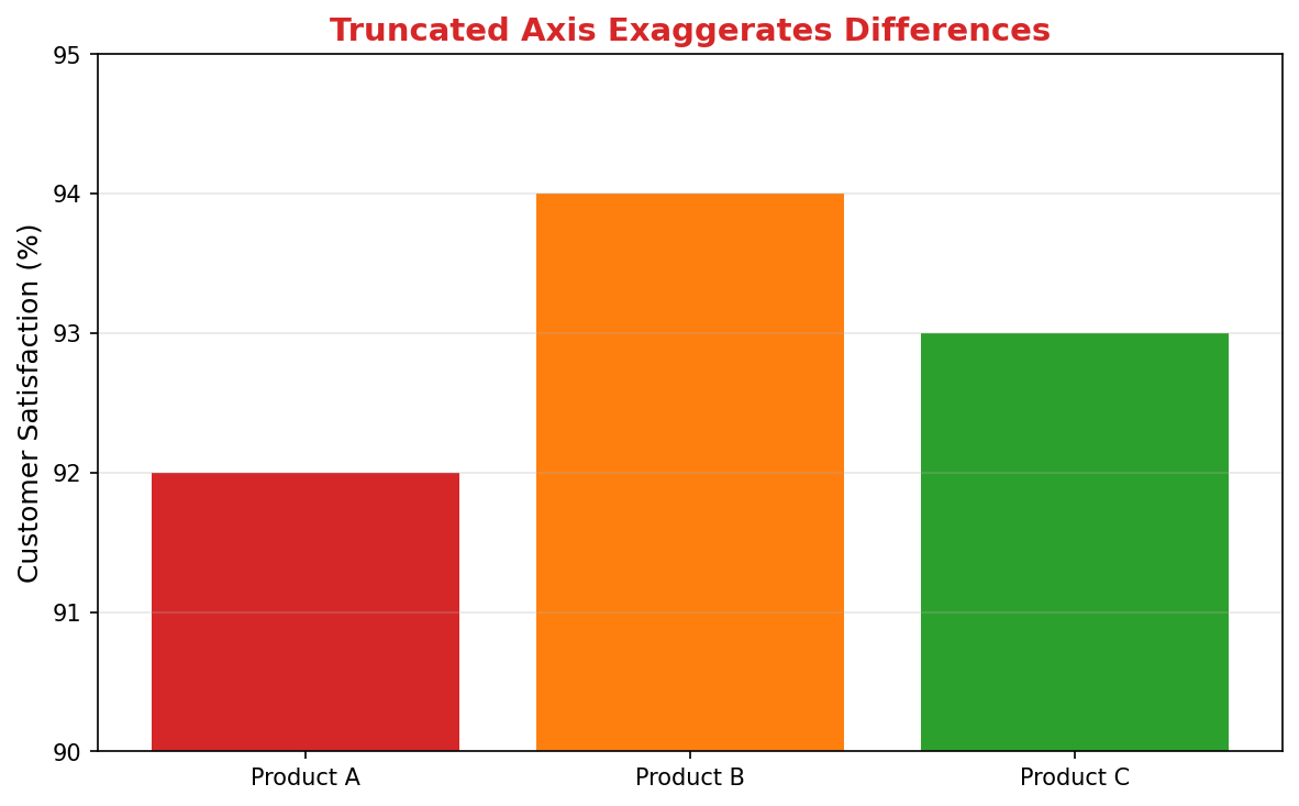
Truncated Y-Axis
⚠️ The Problem:
Starting the Y-axis at 90% instead of 0 makes small differences look huge. This is misleading and can drive wrong decisions.
✅ The Fix:
Always start bar charts at zero to show true proportions. If you need to emphasize small changes, use a line chart instead.
Line Chart Mistakes
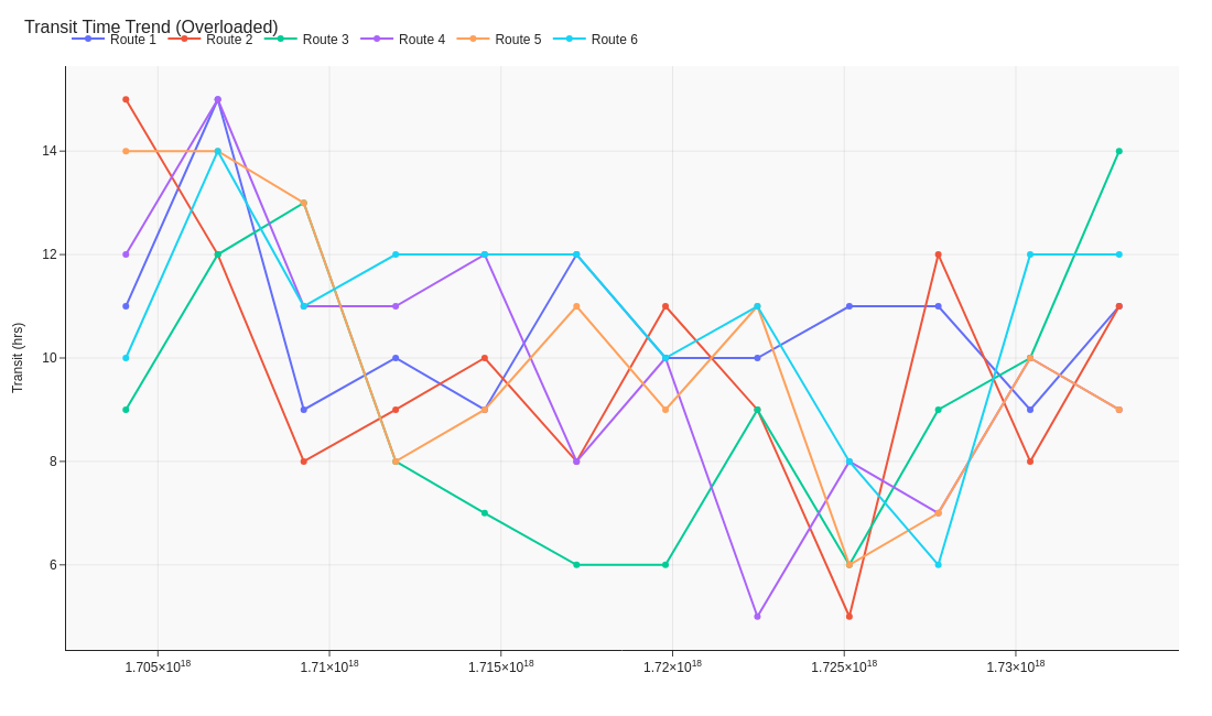
Unclear Data Series
⚠️ The Problem:
When lines aren't clearly differentiated or labeled, viewers struggle to identify which line represents what data.
✅ The Fix:
Use distinct colors and add clear labels directly on the chart. Include markers at data points for easier tracking.
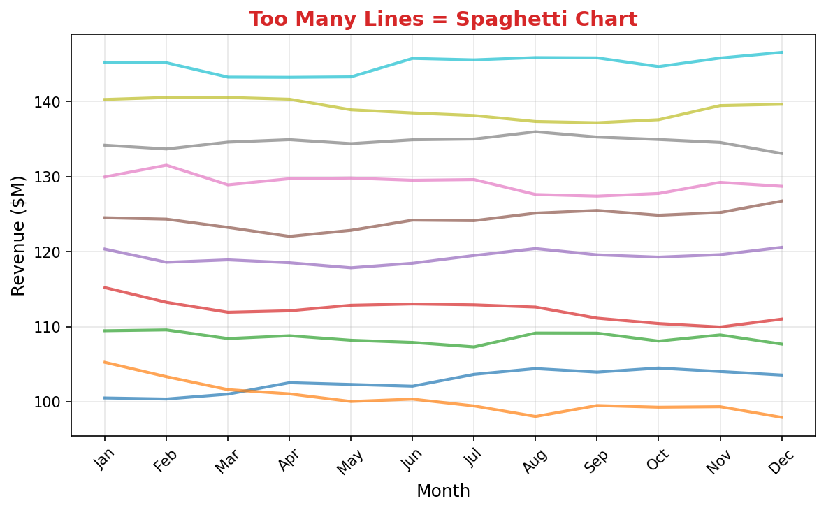
Spaghetti Chart (Too Many Lines)
⚠️ The Problem:
Ten overlapping lines create visual chaos. No single trend is clear, defeating the purpose of showing data.
✅ The Fix:
Limit to 3-4 key lines max. For more series, use small multiples or let users filter interactively.
Pie Chart Mistakes
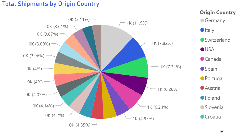
Unlabeled or Unclear Slices
⚠️ The Problem:
Without clear labels or percentages, viewers can't accurately compare slices or understand what each represents.
✅ The Fix:
Always label slices with both category names and percentages. Consider a legend only as supplementary information.
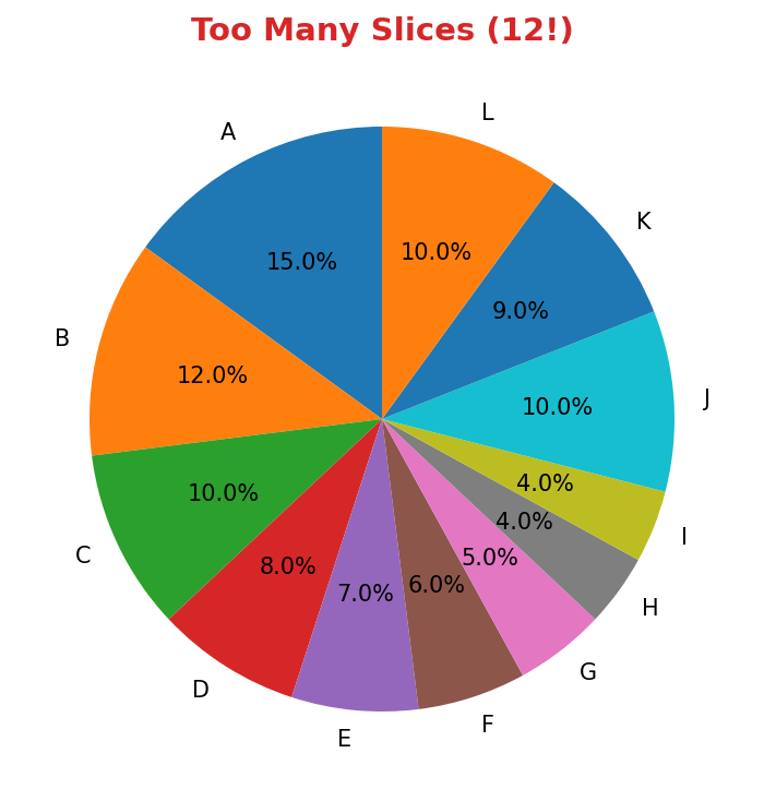
Too Many Slices (12!)
⚠️ The Problem:
Twelve slices are impossible to compare accurately. Small slices become meaningless slivers.
✅ The Fix:
Limit to 5-6 slices maximum. Group smaller categories into "Other" or use a bar chart instead.
Scatter Plot Mistakes
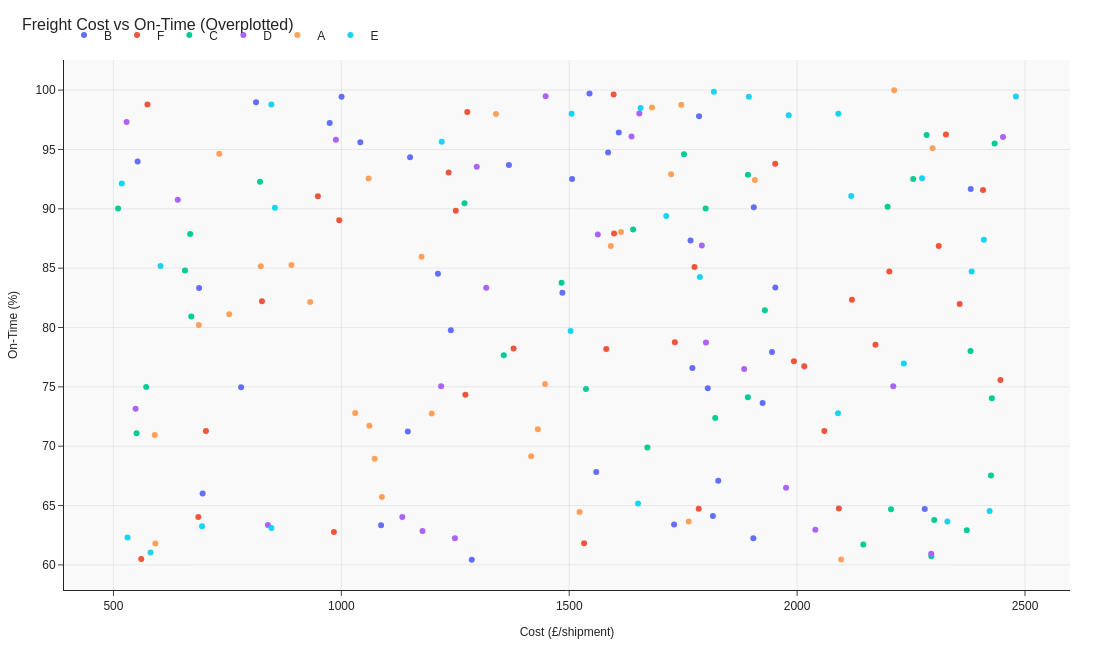
No Clear Pattern or Context
⚠️ The Problem:
Points scattered without context, grouping, or trend lines make it impossible to see relationships.
✅ The Fix:
Add trend lines, group similar data points with colors, and label clusters to reveal patterns.
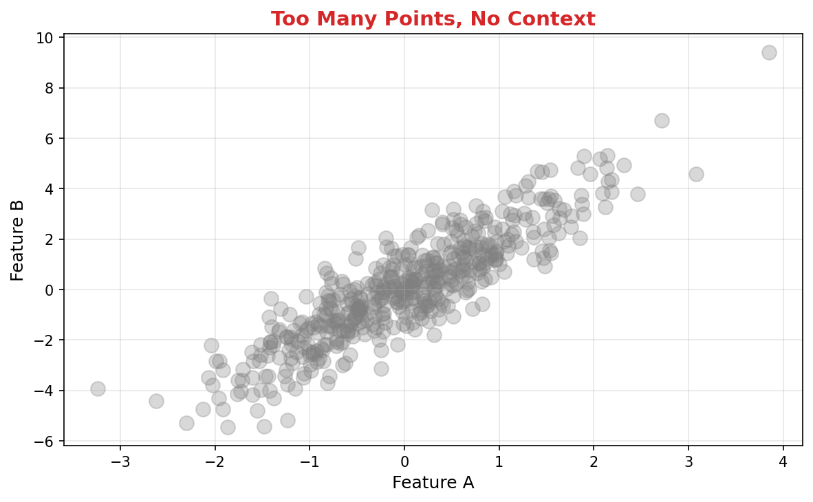
Overcrowding (500+ Points)
⚠️ The Problem:
Too many overlapping points obscure patterns and make individual data points invisible.
✅ The Fix:
Use transparency, jittering, or aggregate into bins/heatmaps for large datasets. Show meaningful groups instead of every point.
Heatmap Mistakes

Rainbow Colors (Jet Colormap)
⚠️ The Problem:
Rainbow color scales mislead viewers. Yellow doesn't naturally represent "more" than green, making patterns hard to interpret.
✅ The Fix:
Use sequential color scales (light to dark single color) for magnitude or diverging scales (two colors from center) for positive/negative.
Funnel Chart Mistakes
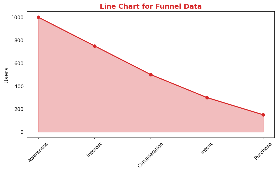
Wrong Chart Type for Funnel Data
⚠️ The Problem:
Using a line chart for conversion funnel data doesn't show the progressive drop-off clearly. The funnel metaphor is lost.
✅ The Fix:
Use a proper funnel chart (or horizontal bars) that visually narrows at each stage, making conversion rates instantly clear.
Ready to Create Better Visualizations?
Use our free tools and guides to choose the right charts and avoid these mistakes