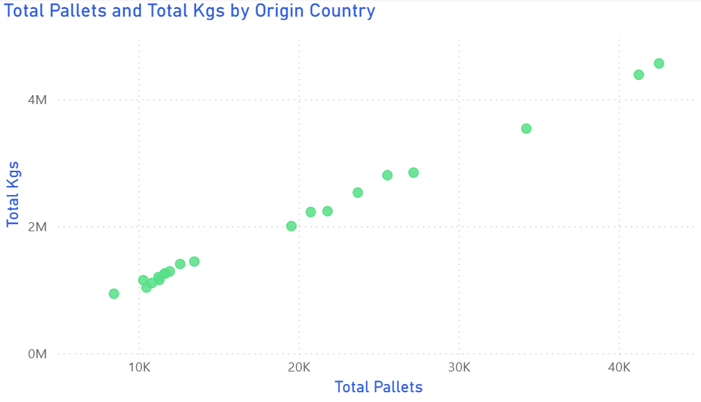
Scatter Plot
Scatter plots reveal how two supply-chain measures move together — such as freight cost versus on-time delivery rate.
Example do and don't images
🔍 More Examples: Common Pitfalls
These are some of the most frequent mistakes we see in real dashboards. Learn to spot and fix them:


Do's
-
Label axes clearly.
State units — £ per shipment and % on-time — to ground interpretation.
-
Add benchmarks.
Reference lines for cost or reliability targets orient the viewer.
-
Use size or colour with restraint.
Reserve it for meaningful dimensions like carrier volume or mode.
Don'ts
-
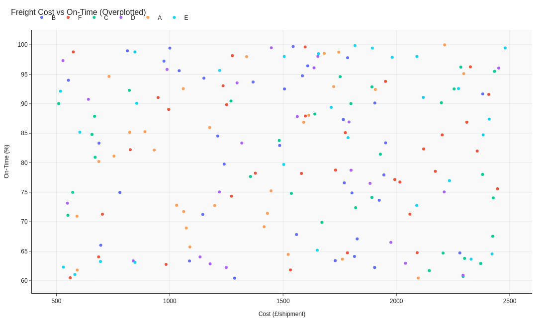
Avoid overplotting.
Too many carriers obscure correlation; sample or cluster points.
-
Skip opaque markers.
Transparency reveals density without overlap issues.
-
Don’t label everything.
Highlight only the key outliers; rely on tooltips for the rest.
Use cases
-
Freight cost vs on-time rate
Expose expensive yet unreliable partners.
-
Distance vs carbon emissions
Quantify sustainability trade-offs.
-
Order size vs damage rate
Find breakpoints in handling efficiency.
Common Mistakes to Avoid
Even experienced analysts make these errors. Here's how to spot and fix them:
Too many data points
Why it's bad: Overplotting obscures patterns and makes the chart unreadable.
Fix: Use transparency, jittering, or aggregate into hexbins for large datasets.
Missing trend line
Why it's bad: Viewers struggle to see the relationship without guidance.
Fix: Add a regression line or loess curve to show the trend clearly.
Ignoring outliers
Why it's bad: Outliers compress the main data and hide the real story.
Fix: Identify and label outliers, or use axis breaks to focus on the main cluster.
Accessibility Guidelines
Make your visualizations accessible to everyone, including users with visual impairments, color blindness, or who rely on screen readers.
Color Considerations
Use colorblind-safe palettes:
- Avoid: Red-green combinations (8% of men are red-green colorblind)
- Use: Blue-orange, purple-yellow, or add patterns/textures
- Test: Use tools like Color Oracle or Coblis to simulate color blindness
Recommended palettes:
Contrast & Legibility
Meet WCAG 2.1 standards:
- Text contrast: Minimum 4.5:1 for normal text, 3:1 for large text
- Chart elements: 3:1 contrast between adjacent colors
- Labels: Use dark text on light backgrounds (or vice versa)
Font guidelines:
- Minimum 12pt for body text, 14pt+ preferred
- Avoid decorative or overly thin fonts
- Use bold for emphasis, not color alone
Screen Reader Support
Essential elements:
- Alt text: Describe the chart's key insight, not just "bar chart"
- Data tables: Provide raw data as an accessible table alternative
- Aria labels: Use aria-label for interactive elements
Example alt text:
"Bar chart showing sales increased 30% from Q1 to Q2, with Q2 reaching $2.5M. Technology had the highest growth at 45%."
Additional Techniques
Don't rely on color alone:
- Use patterns, textures, or shapes to differentiate categories
- Add direct labels to data points when possible
- Use icons or symbols alongside colors
Interactive features:
- Ensure keyboard navigation works (tab, arrow keys)
- Provide text summaries of key findings
- Allow users to toggle between visual and tabular views
📖 Helpful Resources
- Color Oracle: Free color blindness simulator for Windows, Mac, Linux
- WebAIM Contrast Checker: Test color contrast ratios
- ColorBrewer: Colorblind-safe color schemes for maps and charts
- WCAG 2.1 Guidelines: Full accessibility standards for web content
Story tip
Scatter plots turn complexity into pattern — showing trade-offs between cost, speed, and quality.