📊 Sales Dashboard Transformation
How we cut reporting time from 4 hours to 15 minutes while improving decision quality
The Challenge
🔥 The Situation
A growing B2B software company was drowning in sales data. Their sales manager spent 4 hours every Monday compiling spreadsheets for the weekly leadership meeting. Even then, executives struggled to extract actionable insights.
The result? Slow decision-making, missed opportunities, and frustrated teams on all sides.
❌ Key Problems
- Time-consuming manual work: Sales manager manually pulled data from 5 different systems into Excel
- Inconsistent reporting: Different metrics calculated differently each week, causing confusion
- Delayed insights: By Monday, the data was already outdated - couldn't react to Friday's trends
- No drill-down capability: Executives asked "why?" but the spreadsheet couldn't answer
- Poor visual design: Color-coded cells looked busy and were hard to interpret quickly
- Version control chaos: Multiple Excel versions floating around via email
The Solution
📊 Visual Transformation
❌ The Old Way: Chart Chaos
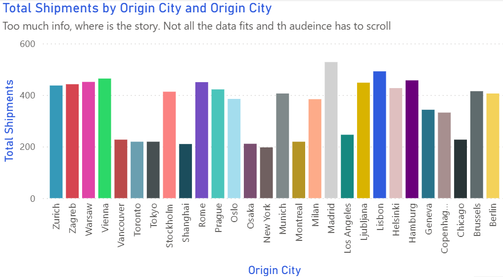
Too many colors, no clear hierarchy - which bar should I focus on?
✅ The New Way: Clean & Clear
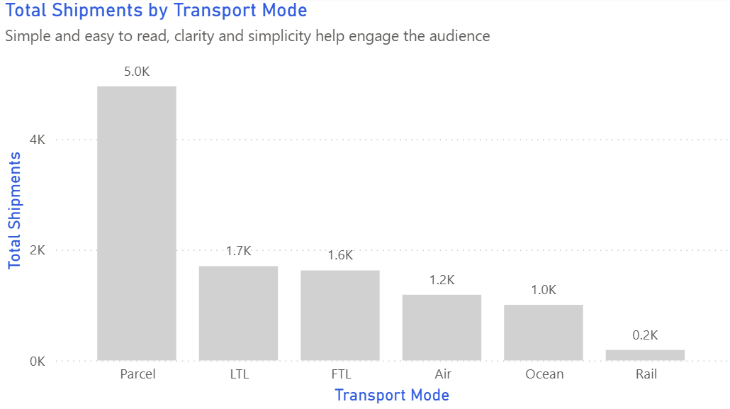
Single color with highlighted outliers - instantly shows top performers
❌ Before: Spreadsheet Chaos
- 30+ tabs in one massive Excel file
- Color-coded cells (red/yellow/green) everywhere
- 15 different chart types on one sheet
- No clear focal point
- Updated manually once per week
✅ After: Clean Dashboard
- Single-page overview with drill-down
- Consistent color scheme (brand blue/purple)
- 3 core KPI cards + 4 supporting charts
- Clear visual hierarchy
- Real-time data refresh
🔧 Four Key Changes We Made
Before: 20+ metrics scattered across tabs
After: 3 hero KPIs at the top (Pipeline Value, Win Rate, Average Deal Size)
Why it worked: Focus on what actually drives decisions. Everything else became secondary.
Before: All charts the same size, competing for attention
After: Large trend chart showing pipeline over time, smaller breakdowns below
Why it worked: Eyes know where to look first. The big chart tells the story.
Before: Pie charts for trends, 3D bars for comparisons, scatter plots for everything
After: Line chart for pipeline trends, bar chart for rep comparison, funnel for conversion stages
Why it worked: Right visual for the right question = faster comprehension.
Before: Separate tabs for each region/product/time period
After: Single view with dropdown filters for region, product line, and date range
Why it worked: Self-service analysis. Executives could explore without waiting for IT.
✅ The Technical Stack
- Data source: Automated connection to Salesforce CRM
- Tool: Power BI (chose for existing Microsoft stack)
- Refresh schedule: Every 2 hours during business hours
- Access: Web-based + mobile app for on-the-go viewing
The Results
📉 Before Metrics
- Reporting time: 4 hours/week
- Meeting duration: 60 minutes
- Decision speed: 2-3 days
- Data accuracy issues: 2-3 per month
- Executive satisfaction: "Meh"
📈 After Metrics
- Reporting time: 15 minutes/week
- Meeting duration: 20 minutes
- Decision speed: Same day
- Data accuracy issues: 0 (automated)
- Executive satisfaction: "Love it!"
💡 Key Takeaways
- Less is more: We removed 80% of the original metrics. Nobody missed them.
- Start with questions, not charts: "What decision does this enable?" should guide every visualization.
- Automation saves sanity: The sales manager now spends Monday mornings coaching reps, not wrangling Excel.
- Mobile matters: The VP checks the dashboard from his phone during his commute - something impossible with spreadsheets.
- Iterate based on feedback: We launched v1 in 3 weeks, then refined based on actual usage.
Want to Build Better Dashboards?
Learn the visualization principles that made this transformation possible
Explore Visual Guide →