Pie / Donut Chart
Pie charts show how a few categories contribute to a whole. Use them when audiences want a quick, high-level sense of share.
Example do and don't images
🔍 More Examples: Common Pitfalls
These are some of the most frequent mistakes we see in real dashboards. Learn to spot and fix them:


Do's
-
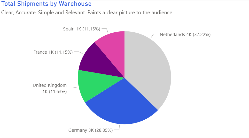
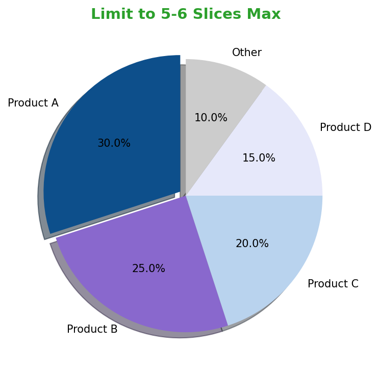
Limit slices to the essentials.
Keep to four or five categories and group the remainder into “Other” so the main contributors dominate.
-
Sort slices and start at 12 o’clock.
Clockwise ordering helps readers follow the story without hunting for the biggest slice.
-
Label values on the chart.
Percent labels or absolute values on each wedge remove the need for a separate legend.
Don'ts
-
Don’t compare pies side by side.
If you need to compare change over time, switch to bars or stacked columns.
-
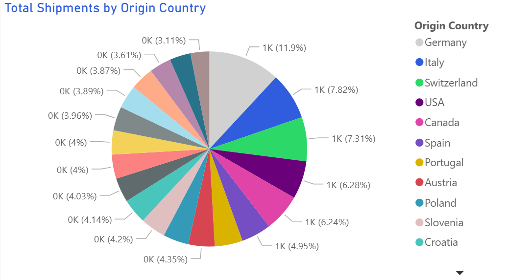
Avoid razor-thin slices.
Tiny wedges are unreadable — group them so every slice has enough area to comprehend.
-
Skip mixed metrics.
Keep either volume or percent in one chart; mixing both confuses the denominator.
Use cases
-
Order volume share by carrier
Show which partners own the majority of throughput.
-
Cost breakdown by expense type
Highlight the dominant contributors to total spend.
-
Support tickets by issue category
Quickly signal the biggest reasons customers reach out.
Common Mistakes to Avoid
Even experienced analysts make these errors. Here's how to spot and fix them:
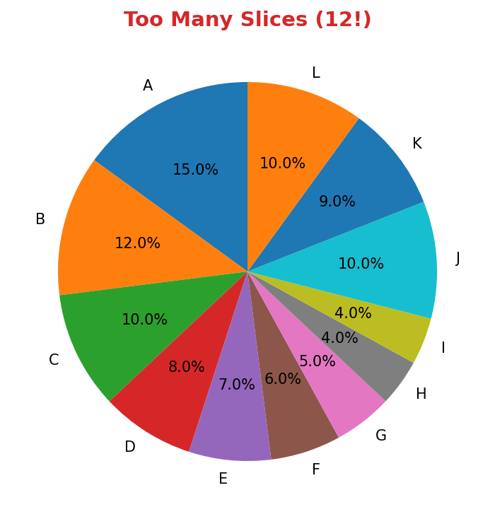
Too many slices
Why it's bad: Small slices are impossible to compare accurately.
Fix: Limit to 5-6 slices maximum. Group small values as "Other".
Using for trends over time
Why it's bad: Pie charts show composition, not change.
Fix: Use a stacked area chart or multiple bars for time-series composition.
3D or exploded slices
Why it's bad: Perspective distortion makes accurate reading impossible.
Fix: Use flat 2D pies. Highlight one slice with color if needed.
Accessibility Guidelines
Make your visualizations accessible to everyone, including users with visual impairments, color blindness, or who rely on screen readers.
Color Considerations
Use colorblind-safe palettes:
- Avoid: Red-green combinations (8% of men are red-green colorblind)
- Use: Blue-orange, purple-yellow, or add patterns/textures
- Test: Use tools like Color Oracle or Coblis to simulate color blindness
Recommended palettes:
Contrast & Legibility
Meet WCAG 2.1 standards:
- Text contrast: Minimum 4.5:1 for normal text, 3:1 for large text
- Chart elements: 3:1 contrast between adjacent colors
- Labels: Use dark text on light backgrounds (or vice versa)
Font guidelines:
- Minimum 12pt for body text, 14pt+ preferred
- Avoid decorative or overly thin fonts
- Use bold for emphasis, not color alone
Screen Reader Support
Essential elements:
- Alt text: Describe the chart's key insight, not just "bar chart"
- Data tables: Provide raw data as an accessible table alternative
- Aria labels: Use aria-label for interactive elements
Example alt text:
"Bar chart showing sales increased 30% from Q1 to Q2, with Q2 reaching $2.5M. Technology had the highest growth at 45%."
Additional Techniques
Don't rely on color alone:
- Use patterns, textures, or shapes to differentiate categories
- Add direct labels to data points when possible
- Use icons or symbols alongside colors
Interactive features:
- Ensure keyboard navigation works (tab, arrow keys)
- Provide text summaries of key findings
- Allow users to toggle between visual and tabular views
📖 Helpful Resources
- Color Oracle: Free color blindness simulator for Windows, Mac, Linux
- WebAIM Contrast Checker: Test color contrast ratios
- ColorBrewer: Colorblind-safe color schemes for maps and charts
- WCAG 2.1 Guidelines: Full accessibility standards for web content
Story tip
Treat pies as a snapshot: emphasise the dominant slice and explain what keeps it large — or what would shift those proportions.