Distribution
Understand the shape of your data before you judge whether a point is unusual.
Profile the distribution with histograms or density curves to see whether it is normal, skewed, or multimodal. That view guides which outlier rule to trust, because different shapes demand different thresholds and sometimes separate segmentation.
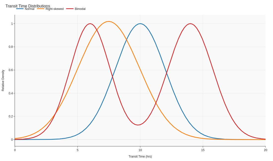
Image source: generate_visuals.py
Code examples
Calculating helper statistics
import pandas as pd
from scipy import stats

# Replace with your numeric series (e.g. sample of 200 readings)
values = pd.Series([...])

# Skewness shows asymmetry, kurtosis shows tail weight
skewness = stats.skew(values, bias=False)
kurtosis = stats.kurtosis(values, fisher=False, bias=False)
print(skewness, kurtosis)
' Skewness and kurtosis for the selected range
=SKEW($D$2:$D$201)
=KURT($D$2:$D$201)

' Guidance based on skew value
=IF(SKEW()>1,"Consider log transform","Symmetric enough")
// Skewness and kurtosis measures for the value column
Dist Skew = SKEW.P('Facts'[Value])
Dist Kurt = KURT.P('Facts'[Value])
Key takeaways
- Distribution shape guides your choice of outlier method.
- Skewness and kurtosis help quantify what the eye can see in a chart.
- Segmenting data often reveals cleaner patterns than chasing single outliers.