Funnel Chart
Funnel charts show how volume narrows through stages — ideal for conversion pipelines, process adherence, or attrition storytelling.
Example do and don't images
🔍 More Examples: Common Pitfalls
These are some of the most frequent mistakes we see in real dashboards. Learn to spot and fix them:
Do's
-
Define consistent stage logic.
Ensure everyone agrees what moves a record from one stage to the next.
-
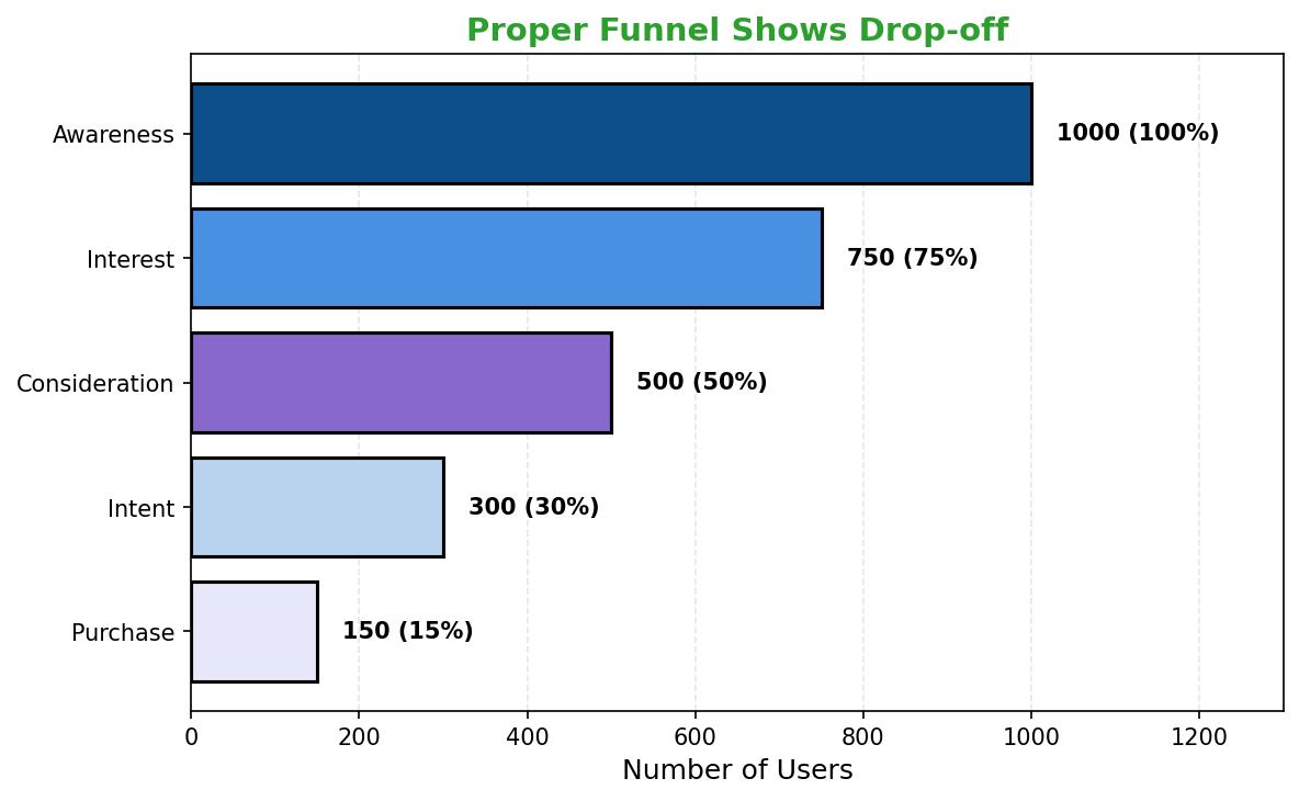
Annotate major drop-offs.
Call out the stages that leak most volume and why.
-
Pair with rate metrics.
Include conversion percentages or stage-to-stage deltas for context.
Don'ts
-
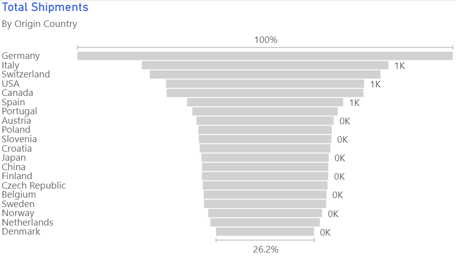
Don’t add too many stages.
Four to six steps keeps the funnel legible; combine minor ones.
-
Avoid misaligned denominators.
Every stage should reflect the same cohort progressing or dropping out.
-
Skip decorative 3D shapes.
Keep the funnel flat so width accurately reflects volume.
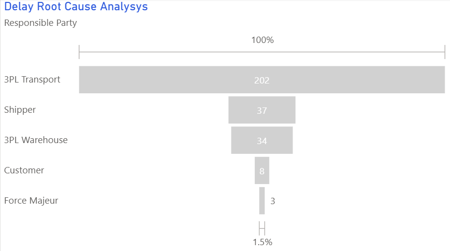
Use cases
-
Sales pipeline conversions
Highlight where opportunities stall or are lost.
-
Incident triage workflow
Track issues from detection to resolution.
-
Customer onboarding
Visualise sign-ups, activations, and active usage.
Common Mistakes to Avoid
Even experienced analysts make these errors. Here's how to spot and fix them:
Inconsistent stage definitions
Why it's bad: Stages that don't follow a logical progression confuse viewers.
Fix: Ensure each stage represents a clear step in the process.
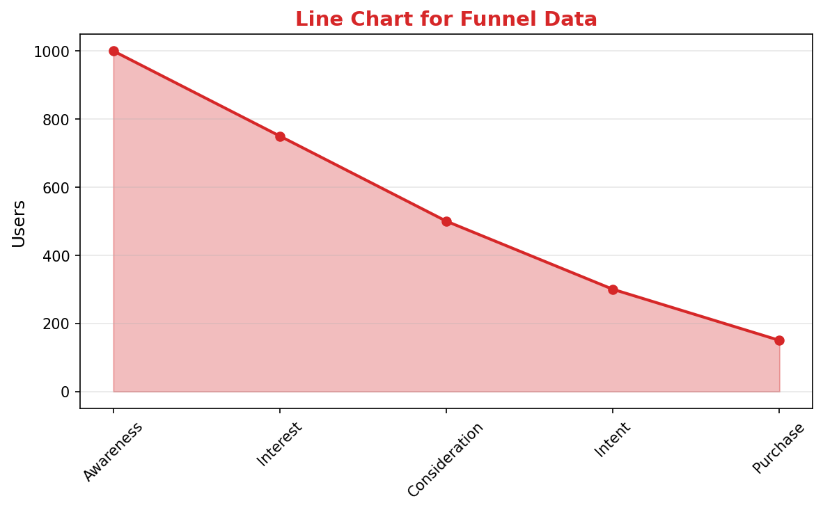
Missing conversion rates
Why it's bad: Raw numbers don't show where the biggest drops occur.
Fix: Label each stage with both count and conversion rate percentage.
Using for non-sequential data
Why it's bad: Funnels only work for progressive, ordered steps.
Fix: Use bar charts for non-sequential comparisons.
Accessibility Guidelines
Make your visualizations accessible to everyone, including users with visual impairments, color blindness, or who rely on screen readers.
Color Considerations
Use colorblind-safe palettes:
- Avoid: Red-green combinations (8% of men are red-green colorblind)
- Use: Blue-orange, purple-yellow, or add patterns/textures
- Test: Use tools like Color Oracle or Coblis to simulate color blindness
Recommended palettes:
Contrast & Legibility
Meet WCAG 2.1 standards:
- Text contrast: Minimum 4.5:1 for normal text, 3:1 for large text
- Chart elements: 3:1 contrast between adjacent colors
- Labels: Use dark text on light backgrounds (or vice versa)
Font guidelines:
- Minimum 12pt for body text, 14pt+ preferred
- Avoid decorative or overly thin fonts
- Use bold for emphasis, not color alone
Screen Reader Support
Essential elements:
- Alt text: Describe the chart's key insight, not just "bar chart"
- Data tables: Provide raw data as an accessible table alternative
- Aria labels: Use aria-label for interactive elements
Example alt text:
"Bar chart showing sales increased 30% from Q1 to Q2, with Q2 reaching $2.5M. Technology had the highest growth at 45%."
Additional Techniques
Don't rely on color alone:
- Use patterns, textures, or shapes to differentiate categories
- Add direct labels to data points when possible
- Use icons or symbols alongside colors
Interactive features:
- Ensure keyboard navigation works (tab, arrow keys)
- Provide text summaries of key findings
- Allow users to toggle between visual and tabular views
📖 Helpful Resources
- Color Oracle: Free color blindness simulator for Windows, Mac, Linux
- WebAIM Contrast Checker: Test color contrast ratios
- ColorBrewer: Colorblind-safe color schemes for maps and charts
- WCAG 2.1 Guidelines: Full accessibility standards for web content
Story tip
Funnel visuals shine when you want to narrate attrition — explain why people drop out and what interventions close the gaps.