HR Analytics Transformation
How a tech company cut time-to-hire by 40% with a hiring pipeline dashboard that revealed hidden bottlenecks
The Challenge
A rapidly growing tech company was struggling to scale their hiring. Their HR team managed 50+ open positions but had no visibility into where candidates were getting stuck or why some positions took 90+ days to fill.
Key Problems:
- HR spent 3 days/week updating spreadsheets manually
- No clear view of hiring pipeline bottlenecks
- Couldn't identify which stages were causing delays
- Average time-to-hire: 60 days (industry standard: 45 days)
- High candidate drop-off rate but didn't know where or why
- Hiring managers constantly asking "where are we with this role?"
The Solution
We built an automated hiring pipeline dashboard that transformed how the HR team tracked, analyzed, and improved their recruiting process. The focus was on making bottlenecks visible and actionable.
Visual Transformation
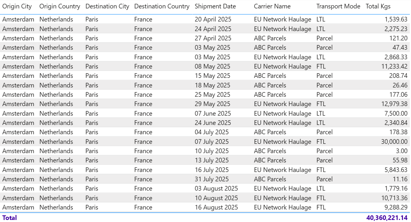
❌ The Old Way: Spreadsheet Chaos

50+ rows, 20+ columns - impossible to spot patterns or bottlenecks
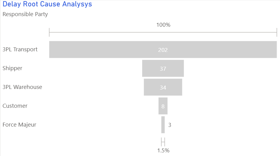
✅ The New Way: Clear Funnel Visualization

Instantly shows 65% of candidates drop off at phone screen stage
Before vs. After
❌ Before
- Manual spreadsheet tracking for 50+ positions
- No visibility into pipeline bottlenecks
- 3 days/week spent on status updates
- 60-day average time-to-hire
- Reactive hiring - always firefighting
- High candidate drop-off (didn't know where)
✅ After
- Automated dashboard with live pipeline view
- Clear funnel showing conversion at each stage
- 2 hours/week on strategic improvements
- 36-day average time-to-hire (40% faster)
- Proactive hiring - spot issues early
- Identified phone screen as problem area
4 Key Changes That Made the Difference
Hiring Funnel Visualization
What we did: Created a funnel chart showing candidate flow from Application → Phone Screen → Technical Interview → Final Interview → Offer → Accepted.
Why it worked: Revealed that 65% of candidates dropped off after phone screen - but only 5% declined. The bottleneck was HR taking 12+ days to schedule technical interviews. Once visible, they prioritized scheduling and reduced drop-off to 35%.
Chart type: Funnel chart with conversion rates labeled at each stage
Time-in-Stage Tracking
What we did: Added box plots showing how long candidates spent in each stage, with median, quartiles, and outliers clearly marked.
Why it worked: Exposed that phone screens averaged 3 days to schedule but some took 20+ days. Set up alerts for candidates stuck >5 days in any stage, allowing HR to intervene proactively.
Chart type: Box plot by hiring stage, with color-coding for stages exceeding targets
Source Effectiveness Analysis
What we did: Visualized candidate sources (LinkedIn, referrals, job boards) with conversion rates and time-to-hire metrics.
Why it worked: Discovered that while LinkedIn generated 60% of applicants, referrals had 3x higher conversion rate and 50% faster time-to-hire. Shifted recruiting budget to employee referral bonuses - saved $45K in recruiting fees.
Chart type: Scatter plot with bubble size = number of hires, x-axis = conversion rate, y-axis = time-to-hire
Hiring Velocity Trends
What we did: Tracked rolling 4-week average time-to-hire by department, with trend lines and targets.
Why it worked: Engineering was consistently 2x slower than sales (80 days vs 40 days). Turns out engineering managers weren't aligned on interview criteria. Standardized process cut engineering time-to-hire from 80 to 50 days.
Chart type: Line chart with departmental trends and target benchmarks
Results
"We went from guessing why hiring was slow to actually fixing it. The funnel visualization alone was a game-changer - we saw immediately that our phone screen scheduling was killing us. Within 2 weeks of fixing that, our time-to-hire dropped by 30%."
Technical Implementation
Key Takeaways
- Funnel charts reveal bottlenecks instantly: Without the funnel, the phone screen scheduling issue would have stayed hidden in spreadsheets.
- Box plots show outliers that drag down averages: The median time was fine, but outliers (20+ day scheduling) skewed the average. Box plots made this obvious.
- Source tracking prevents wasted budget: $60K spent on job boards with 2% conversion vs $15K on referral bonuses with 12% conversion - data made the case for reallocation.
- Real-time alerts beat weekly reports: Automated alerts for candidates stuck >5 days in any stage allowed proactive intervention instead of reactive damage control.
- Department comparisons drive accountability: When engineering saw they were 2x slower than sales, they asked "why?" and fixed their interview process.
- Automation frees HR for strategic work: 3 days/week of spreadsheet work → 2 hours = 22 hours/week for candidate experience improvements and employer branding.
Want to improve your HR analytics?
Learn which visualization techniques work best for hiring funnels, time-in-stage analysis, and source effectiveness.
Explore the Visual Guide