How Clear Visualization Saved 2 Hours Per Day
From 45-minute confusion to 10-minute clarity
The Challenge
Company: Mid-sized logistics company with 5 warehouses
Role: Operations Manager
Problem: Daily performance meetings took 45 minutes because stakeholders couldn't understand the dashboard
The Old Dashboard: What Went Wrong
The Situation: Every morning at 8am, the operations team would gather for a "quick" performance review. The meeting was supposed to take 10 minutes. It regularly ran 45 minutes.
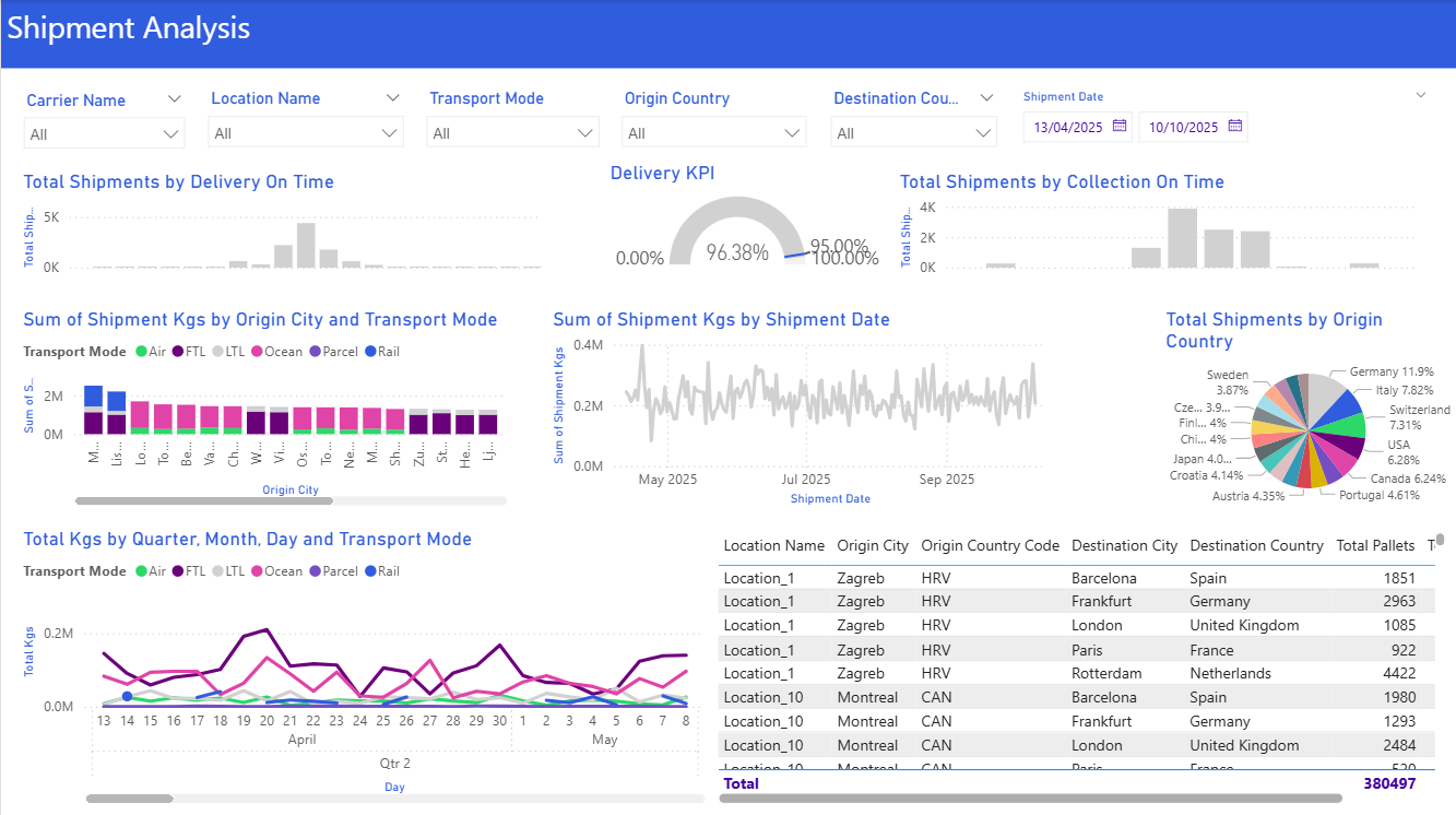
The Problems:
- Too many colors (12 different colors competing for attention)
- No clear hierarchy (everything looked equally important)
- Unclear metrics (What does "performance %" actually mean?)
- Buried insights (Which warehouse needs attention? You had to study it)
- Redundant filters (Transport Mode and Warehouse were both filters AND in the visuals)
The Impact:
- ⏰ 45 minutes per meeting × 5 meetings per week = 3.75 hours wasted weekly
- 😤 Frustrated executives asking "Just tell me what this means"
- 📉 Delayed decisions (had to schedule follow-ups)
- 🔁 Report rebuilt 4 times because "it's still not clear"
The Solution: Apply the Framework
We applied the core principles:
Clarity - One message per section
- Top section: Overall performance (executives scan this first)
- Middle: Trends over time (what's changing?)
- Bottom: Details by warehouse (operators drill here)
Simplicity - Cut the noise
- Reduced from 12 colors to 3 (brand blue, green for good, red for alerts)
- Removed decorative elements
- Used white space strategically
Audience - Design for the 10-second scan
- Executives see "Are we on target?" in 3 seconds
- Operators see "Which warehouse needs attention?" in 10 seconds
The Right Visual - Match insight to chart type
- KPI Cards for overall metrics (quick scan)
- Line Chart for trends (is performance improving?)
- Bar Chart for warehouse comparison (which needs attention?)
The New Dashboard: What Changed
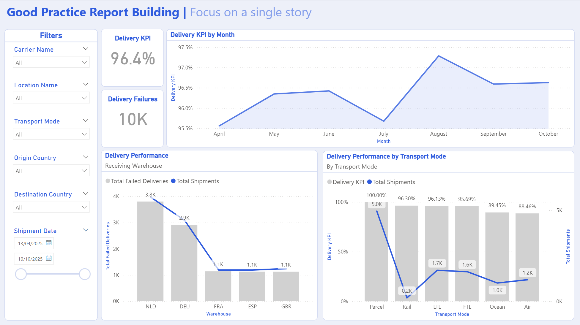
Key Changes:
- ✅ Layout: Left-to-right reading flow, top-to-bottom hierarchy
- ✅ Colors: Just 3 colors (blue for data, green for good, red for alerts)
- ✅ Visuals: 5 KPI cards + 1 line chart + 1 bar chart + 1 detail table
The Results
Time Savings
Before: 45-minute meetings
After: 10-minute meetings
2h 55m
saved per week
Decision Quality
Before: "Let me get back to you"
After: Decisions made in the meeting
Faster response to issues
Report Maintenance
Before: Rebuilt 4 times
After: Zero change requests
Analyst time freed for analysis
"I used to dread these meetings. Now I actually look forward to them because I can make decisions on the spot instead of scheduling follow-ups."
— Operations Director
Key Lessons
Less is More
The old dashboard had 15 visuals. The new one has 7. The new one is more useful.
Why? Because each visual has a clear purpose and tells part of the story.
Color is a Tool, Not Decoration
Every color should mean something: Blue = information, Green = good, Red = alert.
Random colors just create noise.
Design for the Scan, Not the Study
Most people won't study your dashboard. They'll scan it for 10 seconds.
Make sure the most important insight is obvious in that first scan.
Test the "So What?" Question
For every visual, ask: "So what? What should the viewer do with this information?"
If you can't answer, remove it.
Want to Apply This to Your Dashboards?
Use our tools and guides to create dashboards that drive decisions, not confusion.
This case study represents a real project with identifying details changed to protect client confidentiality.